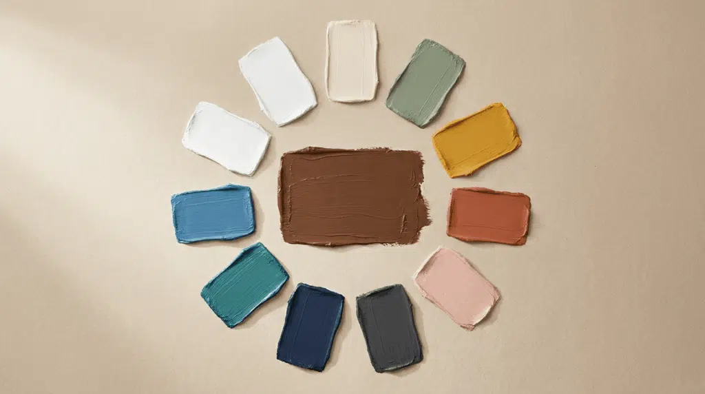
Brown may seem like just one color from a distance, but up close, it’s a spectrum of dozens of shades.
The difference between sand and sienna, or taupe and espresso, isn’t just a name; it’s a shift in warmth and depth.
A sandy beige feels light and airy, while a deep espresso is grounded and heavy. Both are brown, yet they evoke completely different feelings in a painting, a room, or a design.
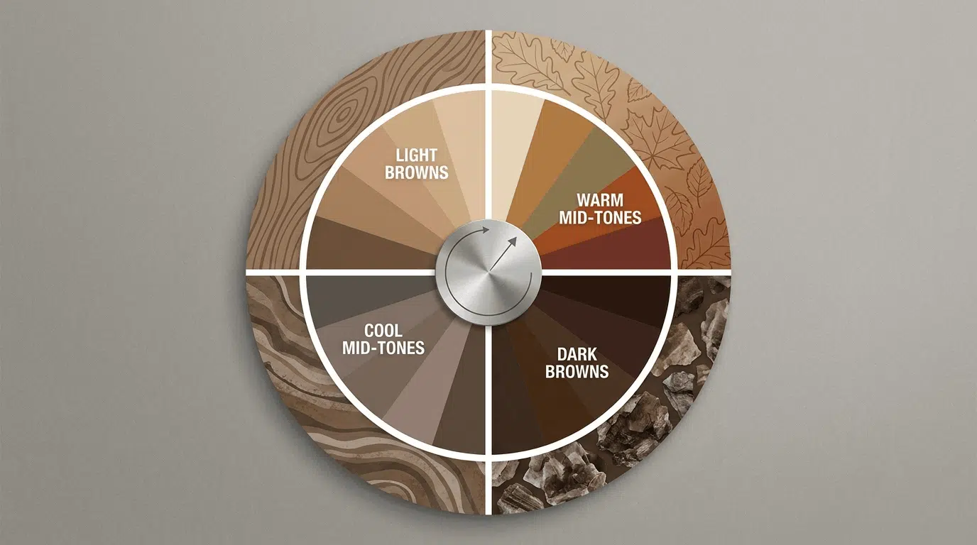
This guide breaks the brown family into 4 groups: light browns, warm mid-tones, cool mid-tones, and dark browns.
Within each group, we’ll explore the key shades, describing their appearance, their presence in nature, and how to mix them.
Brown from Beige and Auburn
Every shade of brown sits somewhere on two scales: warm to cool, and light to dark.
Warm browns have more red and yellow. They feel cozy and sunny. Cool browns have more blue or gray. They feel calm and grounded.
Light browns sit close to white and feel open. Dark browns sit close to black and feel heavy. Most shades in this guide land somewhere in the middle, leaning one way or the other.
Before you start, pick one shade from each end and hold them next to each other.
The difference between a warm light brown like sand and a cool dark brown like espresso is bigger than most people expect. That contrast is what makes the brown family so useful in painting and design.
Within each group, pay attention to whether the shade leans warm or cool. That single thing changes the feeling of everything around it.
The Softest Browns in the Family
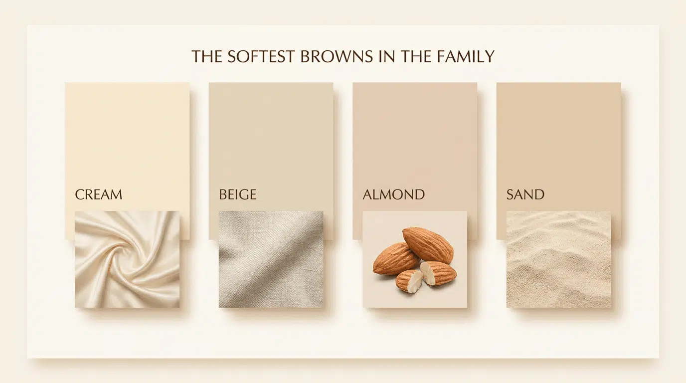
Light browns sit close to white and cream on the value scale. They feel soft and open.
Most have either a warm yellow undertone or a slightly cooler, grayer one. These are the shades you reach for when painting dry sand, pale wood, or light fur.
1. Beige
Beige is the palest of the true browns.
It sits so close to white that some people do not even think of it as brown. The name comes from the French word for undyed, natural wool.
It looks like undyed natural wool: pale, sandy, and warm.
How to mix it: Start with white. Add a very small amount of brown, then drop in the tiniest touch of yellow. Add brown slowly until you reach the right depth.
2. Almond
Almond is slightly cooler than beige.
It has a faint grayish tone that keeps it from reading as warm. Named after the pale inner skin of an almond, it falls between cream and a light gray-brown.
You see almond in natural wood furniture before it is stained, in dry clay, and in the inner flesh of many nuts. It is a quieter shade than beige, with less yellow.
How to mix it: White base, a small amount of brown, a drop of gray, or a tiny amount of blue to cool it down.
3. Cream
Cream is warm white, with a soft brown and yellow glow.
It is the color of heavy dairy cream poured into coffee just before it swirls and mixes. Rich, warm, and very light.
You find it in natural cotton fabric, old paper, the inside of a vanilla pod, and the color of morning light on a white wall.
How to mix it: White with just a touch of yellow and a drop of brown. Less brown than beige, warmer than almond.
4. Sand
Sand is a step warmer and more saturated than beige.
It reads clearly as a warm light brown, with more yellow in it than almond or cream. The name describes it exactly: the color of dry beach or desert sand in full afternoon sun.
You see sand in coastal dunes, dried grasses, pale animal fur, and the color of a lion’s coat in daylight. It is one of the most useful shades for painting outdoor scenes.
How to mix it: Yellow with a small amount of red and just enough blue to pull it toward brown rather than orange.
Warm Mid-Tones: Cozy Browns for Autumn and Warmth
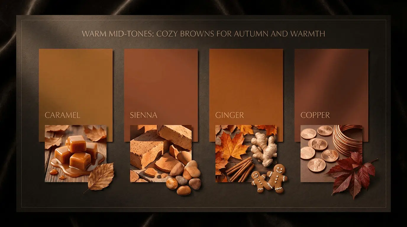
Warm mid-tones contain more red and yellow.
They feel cozy, energetic, and autumnal. These are the shades most people picture when they think of a warm, inviting brown.
They work well in paintings of food, autumn foliage, warm wood, and golden light.
5. Caramel
Caramel is a rich, golden-amber brown named after the color of sugar cooked until it melts and darkens.
It is warmer and more saturated than sand, with strong orange and yellow tones underneath.
You find it in the color of caramel candy, light honey, biscuits just out of the oven, and certain types of polished wood. In fashion, it is one of the most popular browns because it pairs well with almost any other color.
How to mix it: Orange as a base, add more yellow to warm it up, then a small touch of red to deepen it without making it too dark.
6. Sienna
Sienna is a warm, earthy, orangey-brown with a long history in art.
It is one of the oldest pigments in use, made from natural iron oxide clay found in the region around Siena, Italy. You find sienna in terracotta pots, autumn leaves at their peak, and the color of sunlit brick.
It is one of the most useful shades for painting natural scenes because it appears so often in the real world.
How to mix it: Orange with a small amount of red, then a touch of blue to bring it away from pure orange and toward a true earth tone.
7. Ginger
Ginger is a warm, golden-brown with strong orange tones.
It looks exactly like the spice: bright, warm, and golden with enough depth to feel rich rather than pale. It is slightly more orange than sienna and warmer than copper.
You find ginger in the color of gingerbread, certain autumn leaves, the fur of a tabby cat, and red foxes. It is the shade that makes you think of warmth, spice, and late-afternoon light.
How to mix it: Orange base with extra yellow and a very small touch of red. Keep blue out entirely to preserve the brightness.
8. Copper
Copper is a reddish-brown color named after the metal that takes on this warm, glowing tone.
It has more red in it than ginger or caramel, and a slight metallic feeling when it catches light. It sits between orange and brown, leaning toward red.
You find copper in old coins, the leaves of certain Japanese maple trees in autumn, red fox fur, and some bird feathers.
How to mix it: Red and orange in roughly equal amounts, with a very small drop of blue to bring it into brown territory rather than staying at pure orange-red.
Browns that Feel Like Shadows
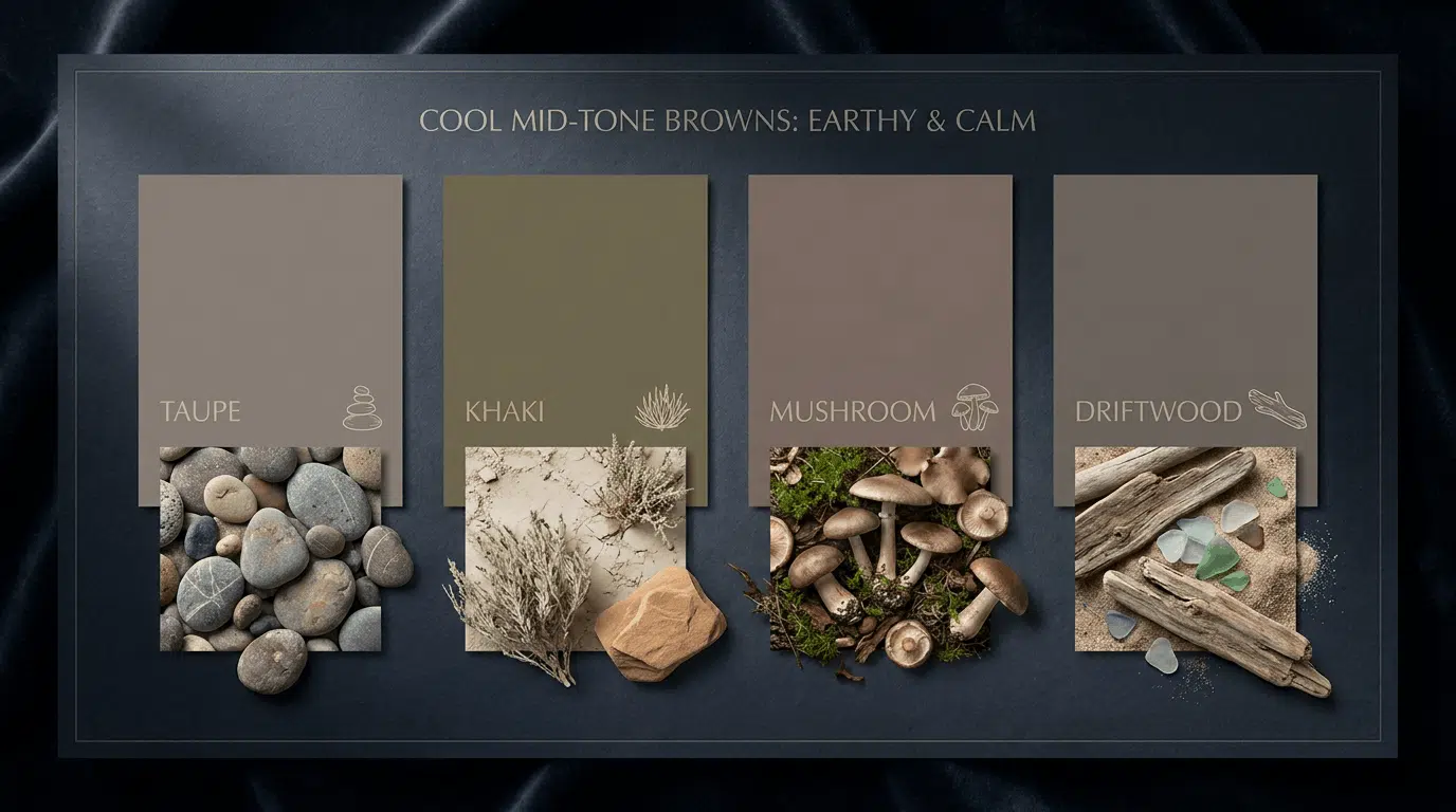
Cool mid-tones have more blue or gray. They feel calm, grounded, and quiet.
These shades are the neutrals of the brown world: they sit back rather than forward, making them useful for shadows, backgrounds, and anything that needs to feel stable rather than warm.
9. Taupe
Taupe is a gray-brown blend that sits exactly between warm and cool.
The name comes from the French word for mole, because the gray-brown fur of a mole resembles this color.
It is one of the most popular neutrals in interior design for exactly this reason: it goes with almost everything.
You find taupe in river stones, dry concrete, the fur of many small animals, and the color of certain dry grasses in winter.
How to mix it: Brown plus white plus a drop of blue or gray to cool it down. Adjust until it sits between warm and cool without leaning clearly in either direction.
10. Khaki
Khaki is a muted, yellowish-brown with a distinctly cool, dusty undertone.
The name comes from the Urdu word for dust. It was first used as a military uniform color because it blended naturally with dry, dusty terrain.
You find khaki in dry summer grass, desert earth, certain moths and lizards, and the color of unprocessed natural linen.
How to mix it: Yellow with small amounts of red and blue to create a muted, dull brown. The key is keeping all three primary colors present so none of them dominates.
11. Mushroom
Mushroom is a soft, cool, pinkish-gray brown.
It sits in a quiet corner of the brown family, close to taupe but with a slightly pinkish or mauve undertone. It is a sophisticated neutral that feels calm and understated.
You find it in the color of button mushrooms, pale driftwood, dry winter reeds, and the silvery-gray bark of certain birch trees.
How to mix it: White base with a small amount of brown, a drop of red, and a touch of blue to create the cool, slightly pinkish tone.
12. Driftwood
Driftwood is a weathered, silvery-gray brown.
It has been bleached and cooled by the sun and water until almost all the warmth has been stripped out. It sits close to gray but with enough brown in it to feel organic rather than cold.
You find it in weathered wood left outdoors, pale beach pebbles, dry winter bark, and the color of old fencing or barn wood.
How to mix it: Brown with a large amount of gray or white, and use a larger drop of blue than you would for taupe. The result should feel gray but with warmth still visible underneath.
Dark Browns: Deep Shades for Intensity and Contrast
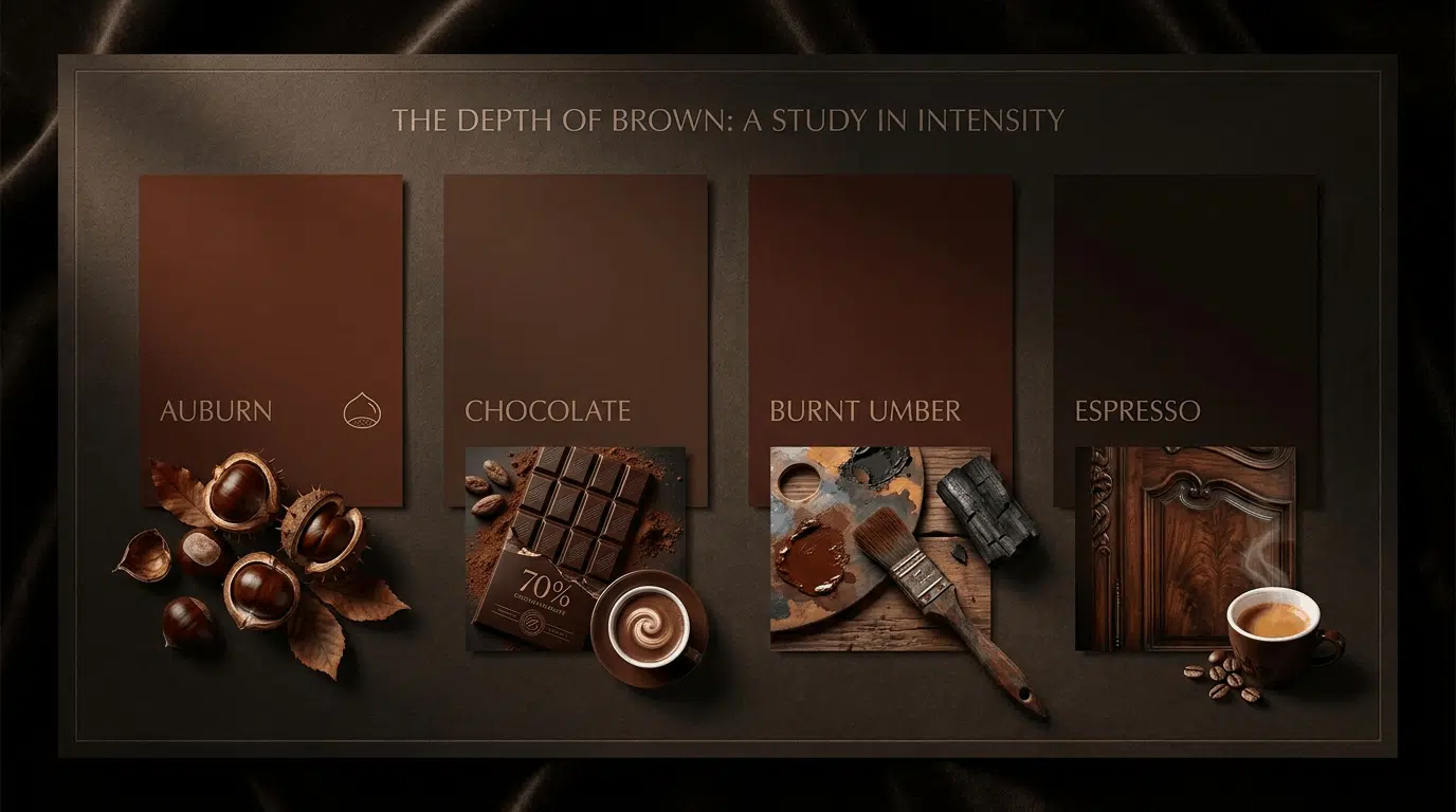
Dark browns have the most depth and richness.
They feel grounded, heavy, and serious. These are the shades you reach for when painting tree trunks, dark soil, dark hair, shadows, and rich wooden furniture.
Each one leans slightly differently: some toward red, others toward blue-black.
13. Chocolate
Chocolate is the shade most people picture when they hear the word brown. It is a medium-dark, warm brown with orange tones underneath. It is rich without being extreme, dark without being close to black.
You find chocolate in dark wooden furniture, cocoa powder, dark soil after rain, and the color of a horse’s coat in sunlight. It is one of the most universally useful browns in painting.
How to mix it: Equal parts red, yellow, and blue, then add a little more red and blue to deepen it. The balance of all 3 primaries keeps it feeling like true brown rather than a muddy orange.
14. Auburn
Auburn is a deep, warm reddish-brown.
It sits between red and brown, with enough red in it to feel bold without crossing into pure red.
It is most commonly associated with hair color, but is equally useful in painting autumn foliage, certain animal coats, and reddish wood.
You find auburn in red-brown horse coats, chestnut shells, certain autumn leaves at their darkest, and mahogany wood.
How to mix it: Red as the base, add brown to bring it away from pure red, then a very small amount of yellow to warm it up and prevent it from going purple.
15. Burnt Umber
Burnt umber is a dark, reddish-brown with cool undertones.
It is one of the most important pigments in art history, made by heating raw umber clay, which shifts the color from a dull yellow-brown to a richer, darker red-brown.
The first recorded use of burnt umber as a color name in English was in 1650.
In painting, it is the standard shadow color for warm scenes and a key mixer for deepening other browns without losing warmth.
How to mix it: Start with chocolate brown, then add more red and a drop of blue. The cool undertone comes from the blue pushing the red-brown slightly away from orange.
16. Espresso
Espresso is the darkest of the standard browns.
It sits very close to black but with warmth still visible underneath, especially in strong light. Named after concentrated coffee, it has depth and intensity without being flat.
You find espresso in dark walnut wood, very dark soil, the color of strong black coffee, and deep shadows in natural scenes.
How to mix it: Start with a dark chocolate brown, add more blue, then a touch of purple to deepen and cool it. The warmth underneath is what makes espresso different from dark.
Conclusion
Brown is not just one color; it ranges from cream to espresso, covering warm and cool, light and dark, subtle and rich.
Understanding the different shades by name allows you to choose the perfect one deliberately, rather than settling for something that doesn’t quite work.
Start by categorizing browns into four main groups: light, warm mid-tone, cool mid-tone, and dark.
Within each group, pay attention to whether the shade leans warm or cool, as this simple decision will dramatically change the overall feel of what you’re creating.
The key to achieving the right brown is knowing how to mix these shades, whether you’re working with primary colors or exploring the tones that make brown so versatile.
With this knowledge, you’re ready to transform your art and add warmth that’s uniquely yours.