Brown is one of the most flexible neutrals in any palette. It works with far more combinations than most people expect.
But not all pairings are equal, and knowing which ones truly complement brown makes the difference between a palette that feels balanced and one that just looks busy.
Before the list, it helps to understand one key point. Blue is brown’s true complementary color on the color wheel. Brown is essentially a darker version of orange, and orange’s complement is blue.
That relationship sits behind many of the strongest pairings.
At the same time, brown works well with a wider range of shades once you understandhow it is builtand how those undertones affect what it pairs best with.
This list covers one of the best reliable combinations, along with guidance on which shades of brown they suit best and how to use each one in practice.
Why Blue is Brown’s True Complementary Color
Brown does not appear on the traditional color wheel as its own entry.
That surprises a lot of people, because brown feels like a fundamental color. It is everywhere in nature. But on the RYB wheel used by painters, there is no brown slot.
Brown is a desaturated, darkened version of orange. On modern color wheels, it appears as one of the darker shades of orange, sitting between red and yellow.
That placement is what determines its complementary color. Brown looks richer and warmer. Blue looks crisper and cooler.
The contrast is immediate and natural, which is why the pairing shows up constantly in nature, in well-designed rooms, and in clothes that look put-together effortlessly.
Every other pairing below has a different logic. But blue is where the color theory starts.
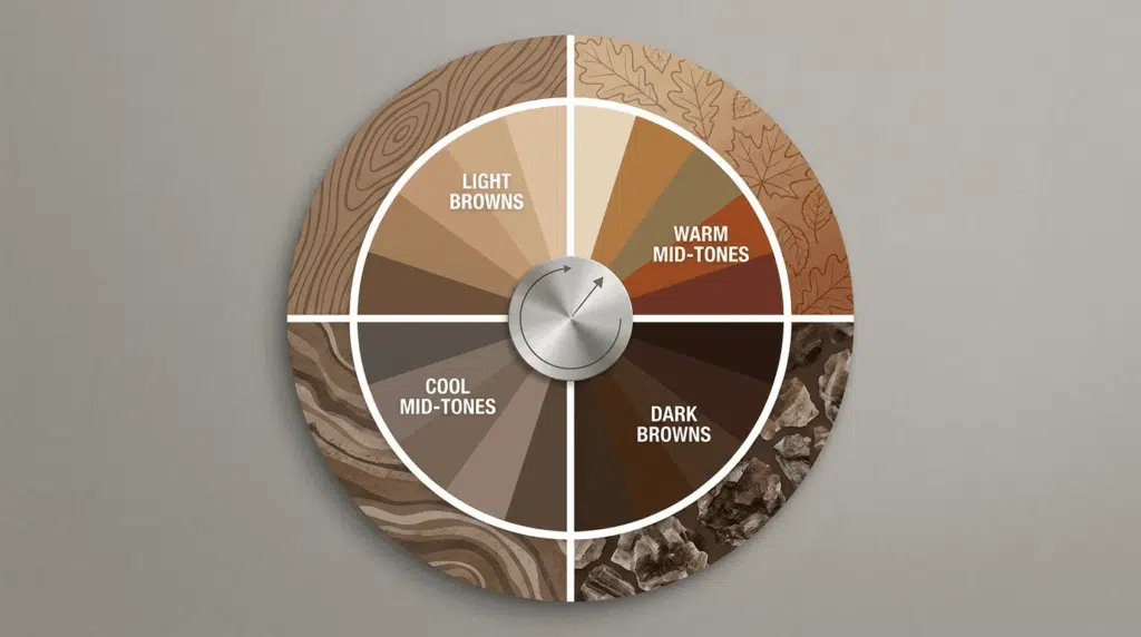
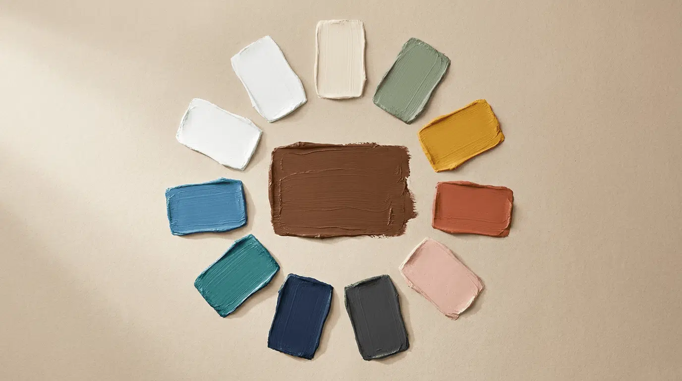
9 Best Brown Complementary Colors
Brown pairs well with more colors than most people expect, but a few combinations stand out for their balance and natural feel.
Some create strong contrast, while others build softer, more cohesive palettes.
The key is knowing how each pairing works and when to use it.
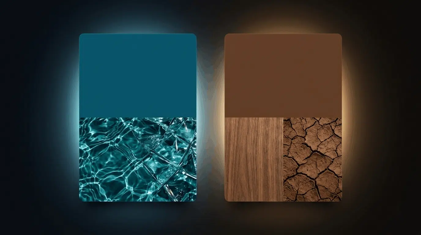
1. Blue
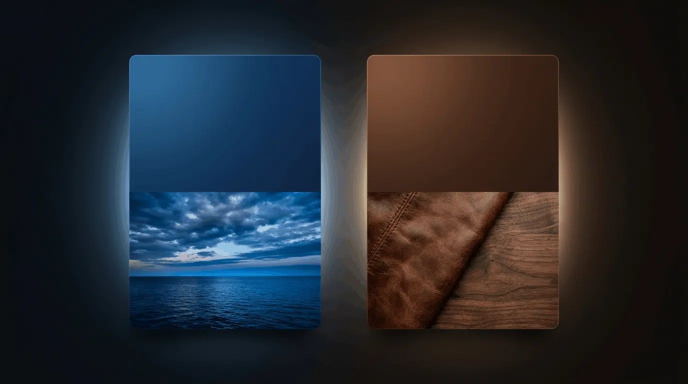
Blue sits directly opposite orange on the color wheel, making it the true complementary color of brown.
The contrast between them is the strongest of any pairing on this list.
- Which blue for which brown: Dark, warm browns like chocolate and espresso pair best with navy or deep cobalt. Both colors are rich, and neither fights the other for dominance.
- In art: Warm brown foregrounds against blue backgrounds, think tree trunks against sky or wooden surfaces against shadowed blue walls, create the natural tension that painters have used for centuries.
- In decor: Navy walls with walnut furniture. Cobalt accent cushions against a chocolate leather sofa. Steel blue paired with camel upholstery.
- In fashion: Cognac leather shoes or a tan bag against a navy outfit. Brown leather accessories with denim. A camel coat over a chambray shirt.
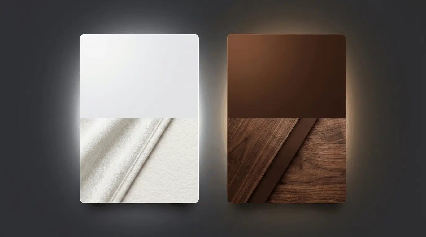
2. Cream and Ivory
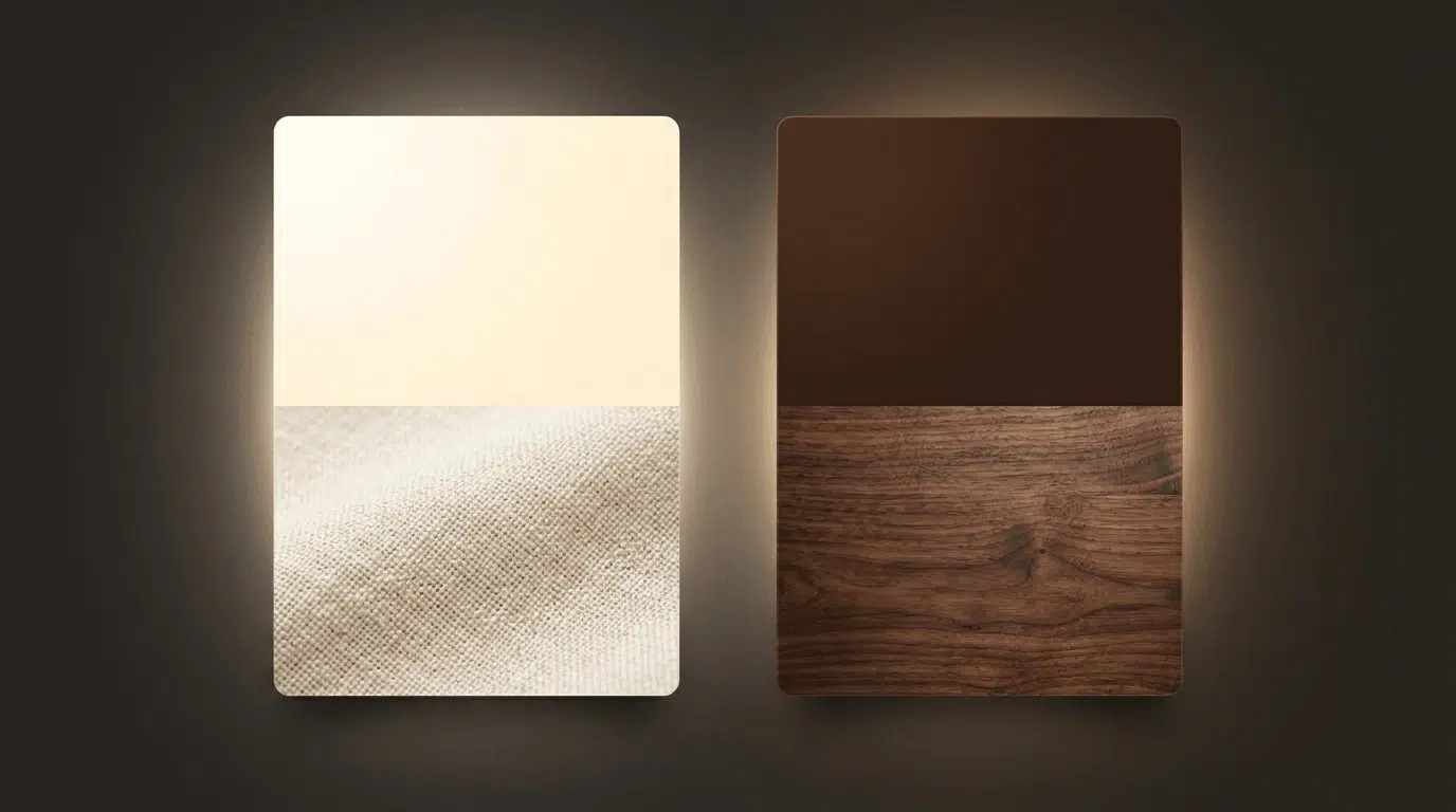
Cream adds warmth and softness without competing with brown. Together, they create a palette that feels settled and expensive.
This is different from white, which reads cooler and more modern. Cream reads warmer and more traditional than white, helping the combination avoid a clinical feel.
- Which brown suits best: Dark browns benefit most. An espresso cabinet against cream walls looks balanced. The lightness of the cream lifts the heaviness of the dark brown without clashing.
- In art: Cream tones in the light areas of a brown-heavy painting, wood grain, aged paper, and worn leather keep the palette warm rather than stark.
- In decor: Cream walls with chocolate furniture is one of the most reliable combinations in traditional interiors. Off-white bedding with a tan or camel headboard.
- In fashion: Cream blouse with camel or cognac trousers. An ivory dress with tan leather sandals. A cream knit with dark chocolate boots.
3. Sage Green
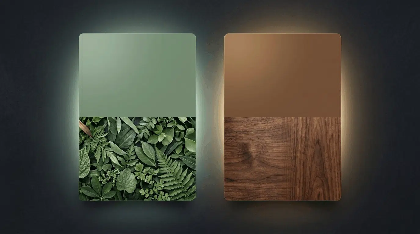
Sage sits in the blue-green range, making it a near-complementary color for warm browns.
The blue in sage counterbalances the warmth in browns like sienna or caramel. It also mimics the pairing of soil and vegetation, which is why the combination never looks forced.
- Which brown suits best: Warm mid-tones. Camel, sienna, tan, and copper sit in the warm zone where sage green provides the best balance.
- In art: Sage works as a shadow or background color behind warm brown subjects. A sage-toned background behind a brown wooden still life reads as natural and grounded.
- In decor: Sage-green walls paired with warm wood furniture are among the most popular interior pairings right now. Olive-sage curtains with a sienna or terracotta rug.
- In fashion: Sage linen with camel accessories. A sage coat with tan boots. Dusty green with warm brown leather.
4. Mustard Yellow
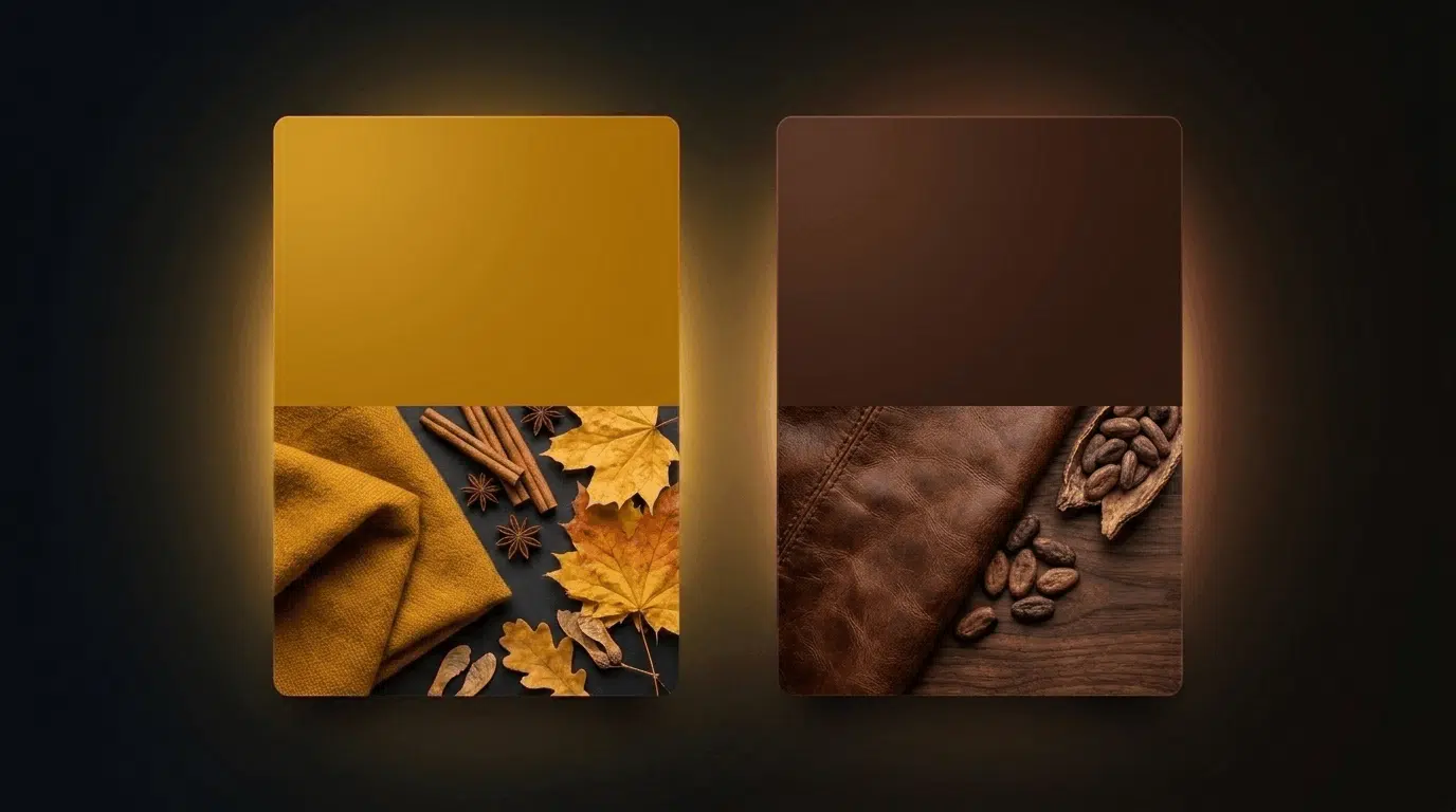
Mustard yellow is muted enough not to overwhelm brown but saturated enough to create real contrast.
Yellow sits in the analogous zone relative to brown’s orange base, making the pairing feel warm and harmonious rather than jarring.
- Which brown suits best: Dark browns. Mustard with chocolate or espresso creates the most striking pairing.
- In Art: Ochre and mustard have been used alongside raw umber and burnt sienna since the Renaissance for this exact reason. The warm contrast between them reads as natural.
- In Decor: Mustard cushions or a mustard accent chair against a brown sofa. Ochre walls with dark walnut furniture. A mustard rug against chocolate brown flooring.
- In Fashion: Mustard yellow with chocolate brown is a classic autumn combination. A mustard scarf with a dark brown coat. Ochre trousers with a tan or camel top.
5. Terracotta
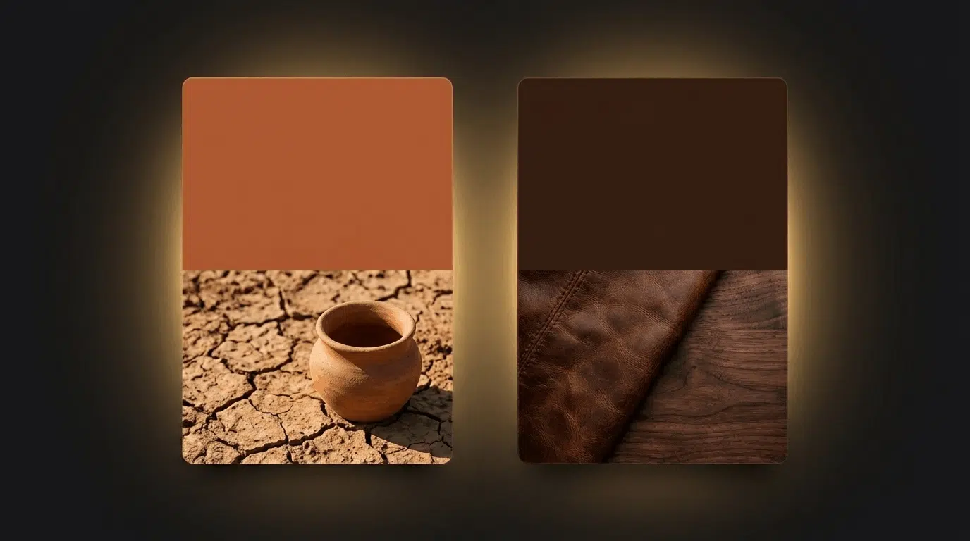
Terracotta sits in the analogous zone next to brown, both being warm earth tones with orange and red undertones. The pairing feels natural and Mediterranean.
Unlike the complementary contrast of blue, terracotta creates harmony rather than contrast, a palette that feels unified and warm.
- Which brown suits best: The contrast between the cool undertones of espresso and the warm red-orange of terracotta creates the most interesting pairing.
- In art: Terracotta and brown together cover a huge range of what appears in outdoor scenes: soil, clay, brick, dried leaves, and sun-baked earth.
- In decor: Terracotta walls with chocolate or walnut furniture. Rust and brown in a living room creates a warm, grounded palette. Terracotta tiles with dark brown wood.
- In fashion: Terracotta and brown as a head-to-toe earth tone palette works well in autumn and winter. Rust accessories with a dark brown coat.
6. White and Off-White
White provides the sharpest contrast with any shade of brown, preventing a brown-heavy palette from feeling closed in as it reads modern and clean.
- Which brown it suits best: Crisp white against espresso or dark chocolate reads as deliberate and graphic.
- In art: White tones in the lightest areas of a brown painting create depth through value contrast. Without some near-white to anchor the light, brown-heavy compositions can feel flat.
- In decor: White walls with dark brown wood floors are one of the most common and reliable interior combinations.
- In fashion: White shirt with brown trousers or chinos. A white dress with cognac sandals. White linen with camel leather accessories.
7. Teal
Teal is the best complementary color for warm, reddish browns.
The green in teal counterbalances the red warmth in shades like sienna, copper, and auburn in a way that pure blue cannot. It is the most specific and targeted pairing on this list.
- Which brown it suits best: Sienna, copper, auburn, and warm caramel sit in the zone where teal provides the best balance. Against cooler browns like taupe, teal can feel slightly off. A cooler slate blue is better there.
- In decor: Teal accent wall with warm wood furniture. Blue-green cushions against a sienna or copper-toned sofa. Muted teal against warm walnut or mahogany.
- In art: In painting, teal adds depth to brown-heavy compositions. It works well in water, glass, or distant elements, while brown anchors the foreground with warmth and structure.
- In fashion: A teal scarf or bag against a camel coat. Teal accessories with a warm cognac outfit. A dusty blue-green top with brown leather trousers.
8. Dusty Pink and Blush
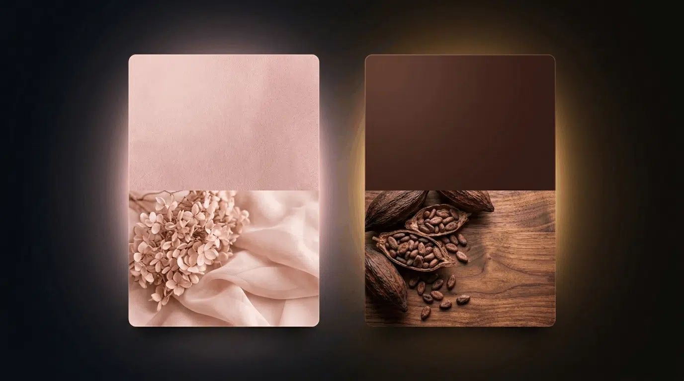
Muted, dusty pink sits in the low-saturation warm zone, working alongside brown without competing.
It adds softness and warmth to dark brown palettes that would otherwise feel heavy. The keyword is muted. Bright or hot pink does not work. Dusty and blush versions do.
- Which brown suits best: Dark browns where a soft, warm lift is needed. Chocolate brown with blush or Dark walnut with dusty rose. Against lighter browns, blush can feel too close in tone.
- In decor: Blush pink walls with chocolate brown furniture in a bedroom. Dusty rose cushions against a dark brown sofa. A blush rug with walnut wood flooring.
- In art: Blush pink softens brown and introduces minimal contrast. It is used in portraits, florals, and skin tones, where brown provides grounding and pink adds warmth and lightness.
- In fashion: A blush dress with cognac sandals and accessories is a reliable spring and summer combination. Dusty rose with a tan leather bag. Peach tones with warm brown outerwear.
9. Charcoal Grey
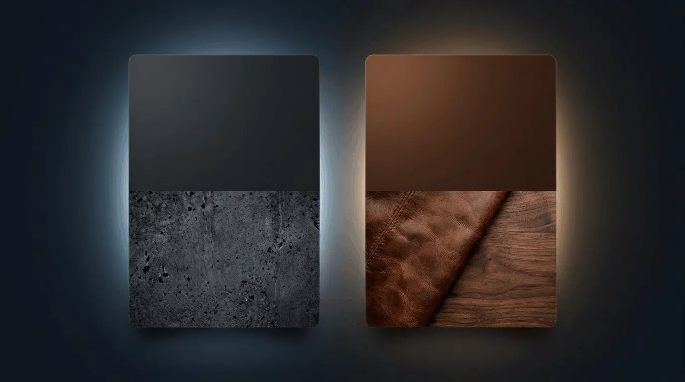
Charcoal sits in the cool neutral zone and balances the warmth of brown without competing with it. This is different from mid or light grey, which can feel cold against brown.
Charcoal is dark enough to hold its own and cool enough to counterbalance the warmth in brown without clashing.
- Which brown suits best: Charcoal against camel creates a modern, sophisticated palette that feels current without being cold. Against very dark browns, charcoal can blend into the background.
- In decor: Charcoal walls with warm wood floors. A charcoal grey sofa with brown leather accent chairs. Charcoal slate tiles with camel or tan upholstery.
- In art: Charcoal grey tones down the warmth of brown and creates a more muted, controlled palette. It works well in shadows, backgrounds, and modern compositions where contrast needs to stay restrained.
- In fashion: Charcoal trousers with a camel or tan coat are one of the cleanest combinations in autumn dressing. Dark grey knitwear with cognac boots.
Quick Reference: Brown Color Pairing Guide
Color | Best Brown Pairing | Effect |
Blue | Chocolate, caramel, tan | Complementary contrast |
Cream/ivory | Chocolate, espresso | Warm softness |
Sage green | Camel, sienna, tan | Natural, earthy |
Mustard yellow | Dark chocolate, espresso | Warm energy |
Terracotta | Espresso, umber | Earthy warmth |
Navy blue | Chocolate, espresso | Rich, formal |
White / off-white | Any dark brown | Clean contrast |
Teal | Sienna, copper, caramel | Cool-warm balance |
Blush / dusty pink | Chocolate, walnut | Soft lift |
Charcoal grey | Camel, tan | Modern neutral |
Wrapping It Up
Brown works with more colors than most people give it credit for.
Blue is the true complementary color on the color wheel and the most reliable starting point.
Brown works with more colors than most give it credit for. Blue is the true complement. But cream, sage, teal, mustard, and charcoal each solve a different problem depending on the shade and the mood you are after.
The right color does not just go with brown.
It responds to the specific warmth or coolness sitting underneath it. That is the distinction most color pairing advice skips over, and the one that matters most in practice.