Have you ever looked at a painting and felt it just worked perfectly without knowing why?
Or maybe you tried to design something yourself, and it felt cluttered no matter what you changed? The secret usually lies in the principles of art.
Think of art as a visual language. If the elements like color and line are the words, then the principles act as the grammar.
They are the essential guides artists use to organize their work into a composition that makes sense to the viewer.
Mastering these concepts is vital for anyone wanting to create or simply appreciate visual art. They help transform a random mix of shapes and colors into a piece that communicates clearly and effectively.
Understanding them changes how you see everything around you.
What Are the Principles of Art?
The 7 principles of art act as a universal guide for creators across all media. Whether you are working in traditional painting, modern graphic design, or even 3D sculpture, these concepts are essential.
They provide the structure needed to organize the visual elements into a cohesive whole. Without this underlying structure, an artwork can easily feel chaotic or confusing to the viewer.
These principles determine how you arrange shapes and colors to guide the eye. They allow you to control the mood and the message of your piece effectively.
Consider them as a set of tools rather than strict rules you must follow. They help you make intentional choices about composition that elevate your work from good to great.
1. Balance
Balance is the distribution of visual weight within an artwork. Just as a physical scale needs to feel stable to be pleasing to the eye, a composition needs to feel stable to be pleasing to the eye.
If one side feels too heavy with dark colors or large shapes, the viewer may feel unease. There are three main ways artists achieve this stability.
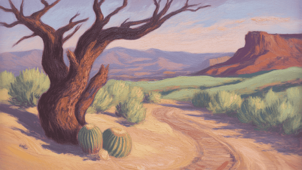
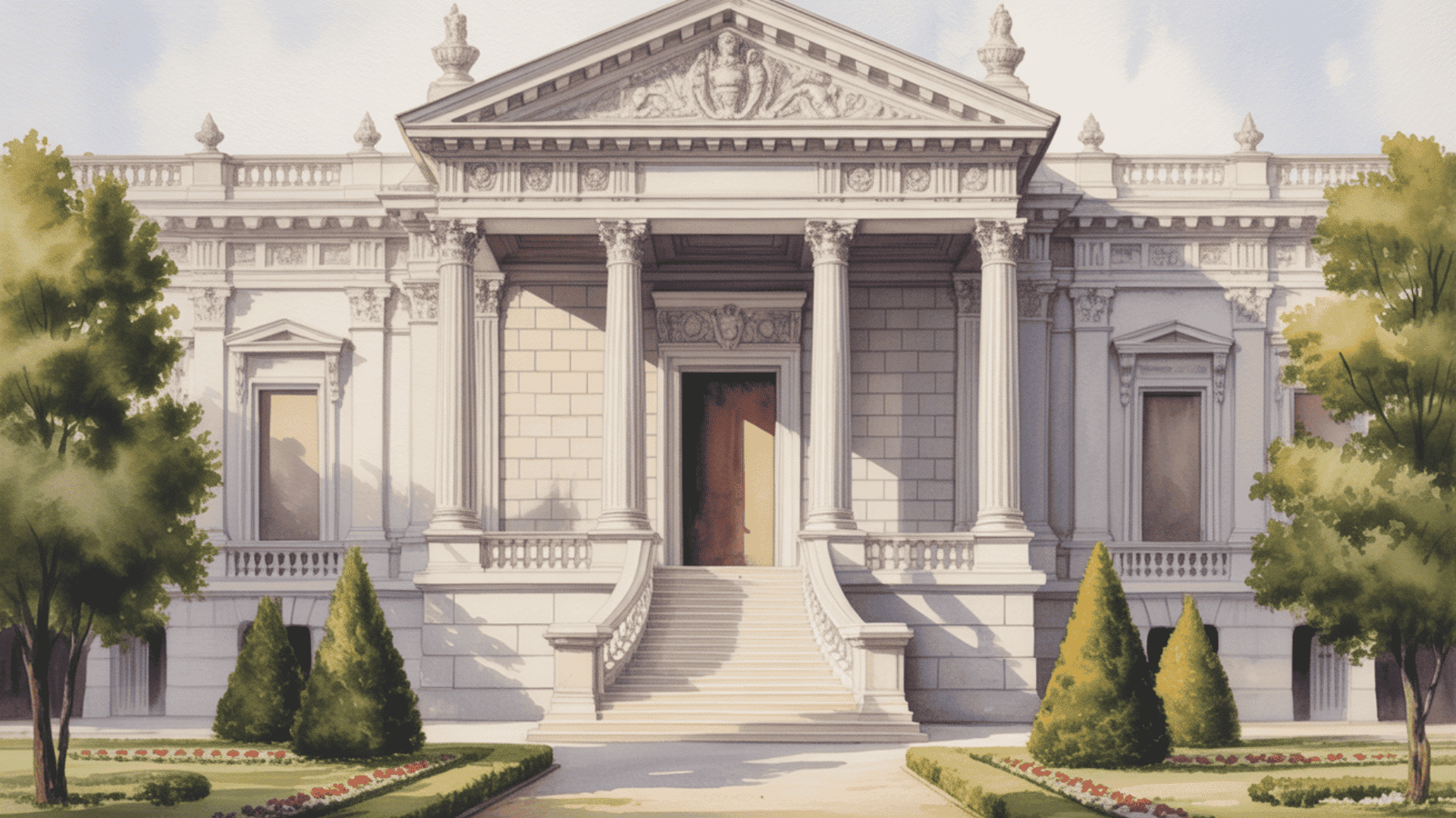
Symmetrical balance occurs when both sides are mirror images of each other or nearly identical. This creates a sense of formality and calm found in many classical paintings.
Asymmetrical balance occurs when two sides differ but still carry equal visual weight. This style feels more dynamic and is often used in modern design.
Radial balance involves elements radiating outward from a central point. Think of a mandala or a sunburst, which draws the eye instantly to the middle.
2. Contrast
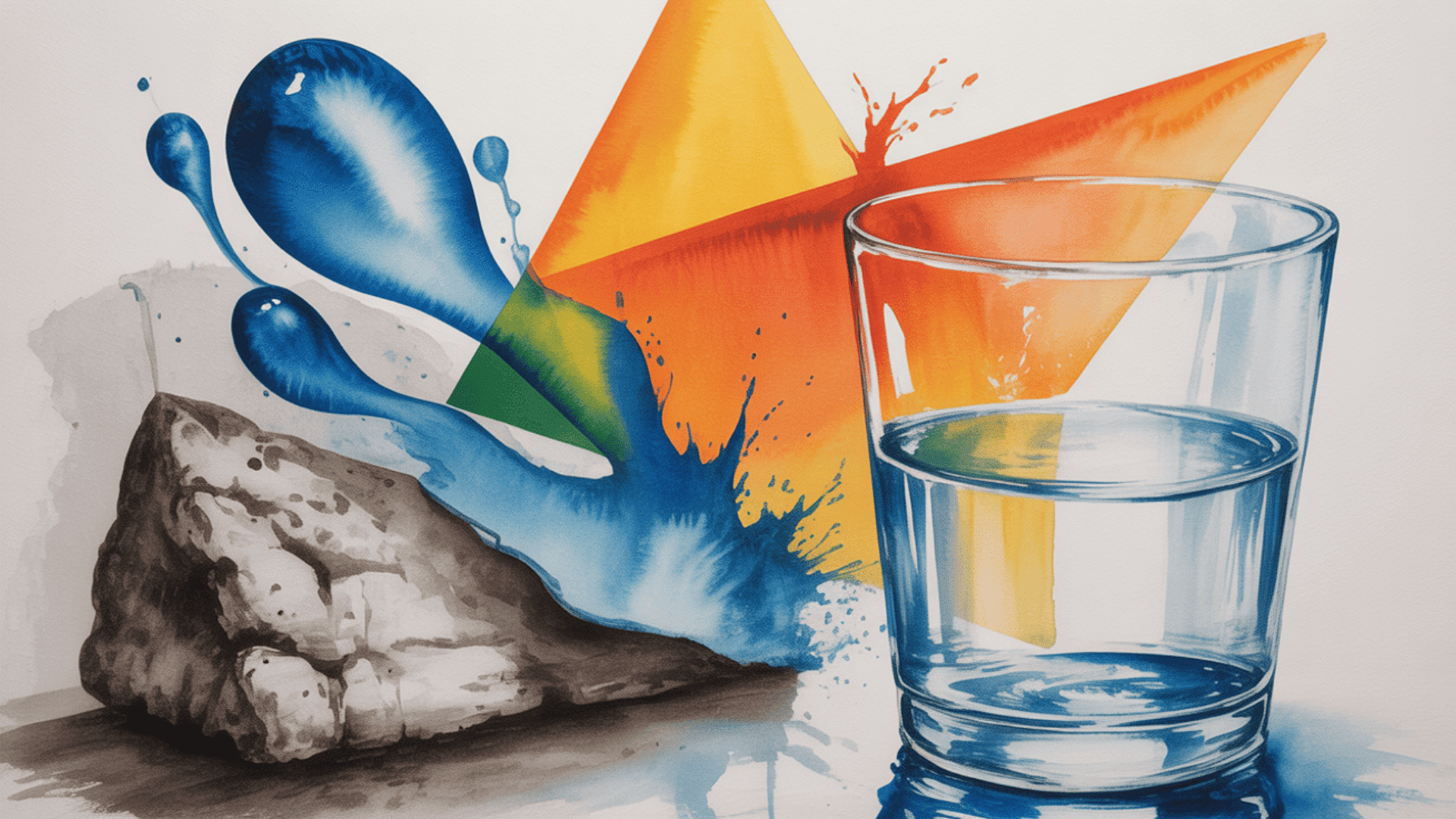
Contrast is all about the arrangement of opposite elements. It is the tool artists use to create visual interest and prevent a piece from looking flat.
When you place distinctively different elements next to each other, you make them stand out. This catches the viewer’s attention immediately.
You can achieve this through color by pairing complementary shades like blue and orange. This creates a high energy that pops off the canvas.
Shape is another way to use this principle. Placing a round, organic shape next to a sharp, geometric one highlights the differences.
Texture also plays a huge role in creating variety. Imagine painting a rough and gritty stone wall next to a smooth and clear glass of water.
3. Emphasis
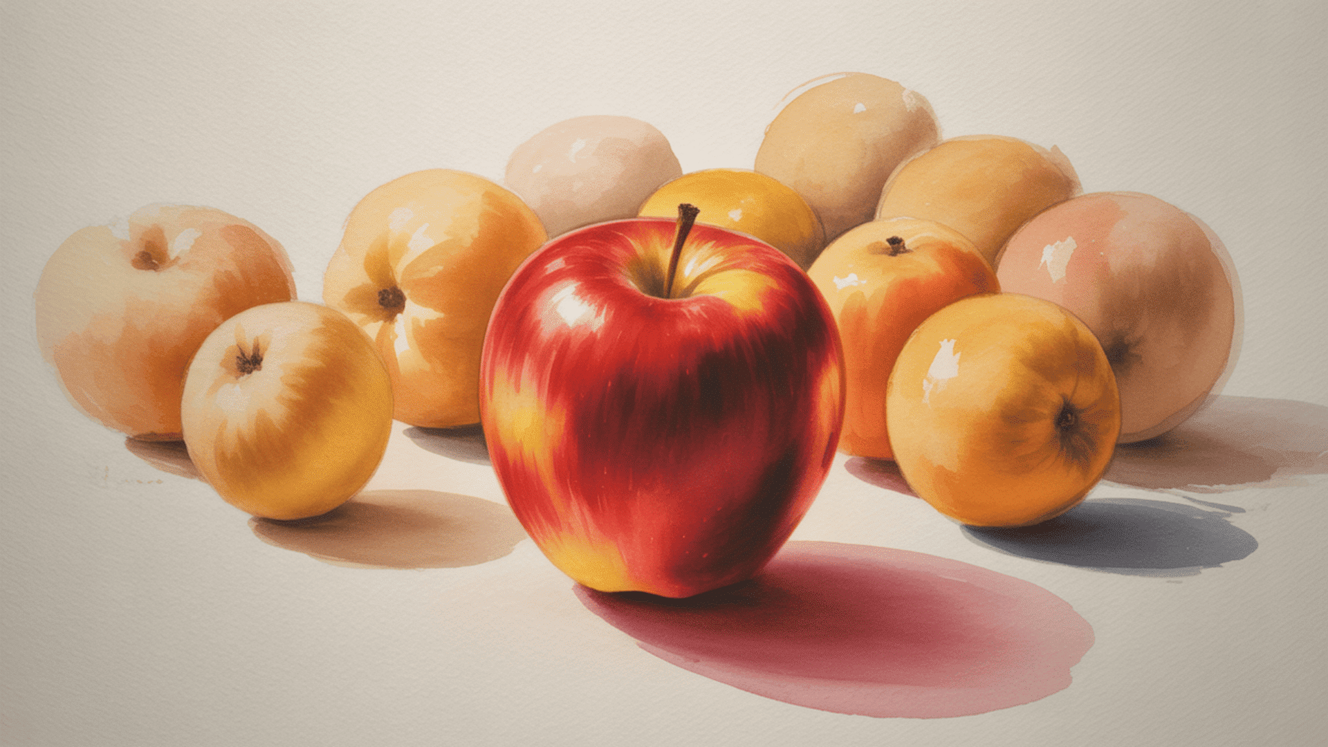
Emphasis acts as the anchor for the viewer’s eye. It is the specific part of the artwork that grabs your attention first.
Artists use this principle to create a focal point. This ensures the viewer knows exactly where to look within the composition.
Without a clear area of emphasis, an artwork can feel confusing. The viewer might not know what is important or where the story begins.
You can create this focus by isolating a single object. If one apple sits alone away from a group of oranges, the eye goes straight to the apple.
Placement is another key technique for directing focus. Putting an object near the center often signals that it is the most important element.
4. Movement
Movement describes the path the viewer takes through the artwork. It is how the artist controls where you look and how fast your eye travels.
This principle guides the eye along lines and edges or through shapes and colors. It creates a sense of action within a static image.
Rhythm plays a large role in creating this sense of motion. When similar shapes are repeated, they can create a visual beat that your eye follows.
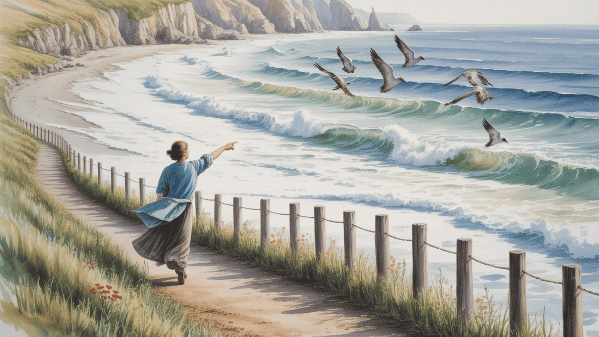
Artists often use implied lines to direct movement. For example, a figure pointing a finger creates an invisible line that your eye naturally wants to follow.
5. Pattern
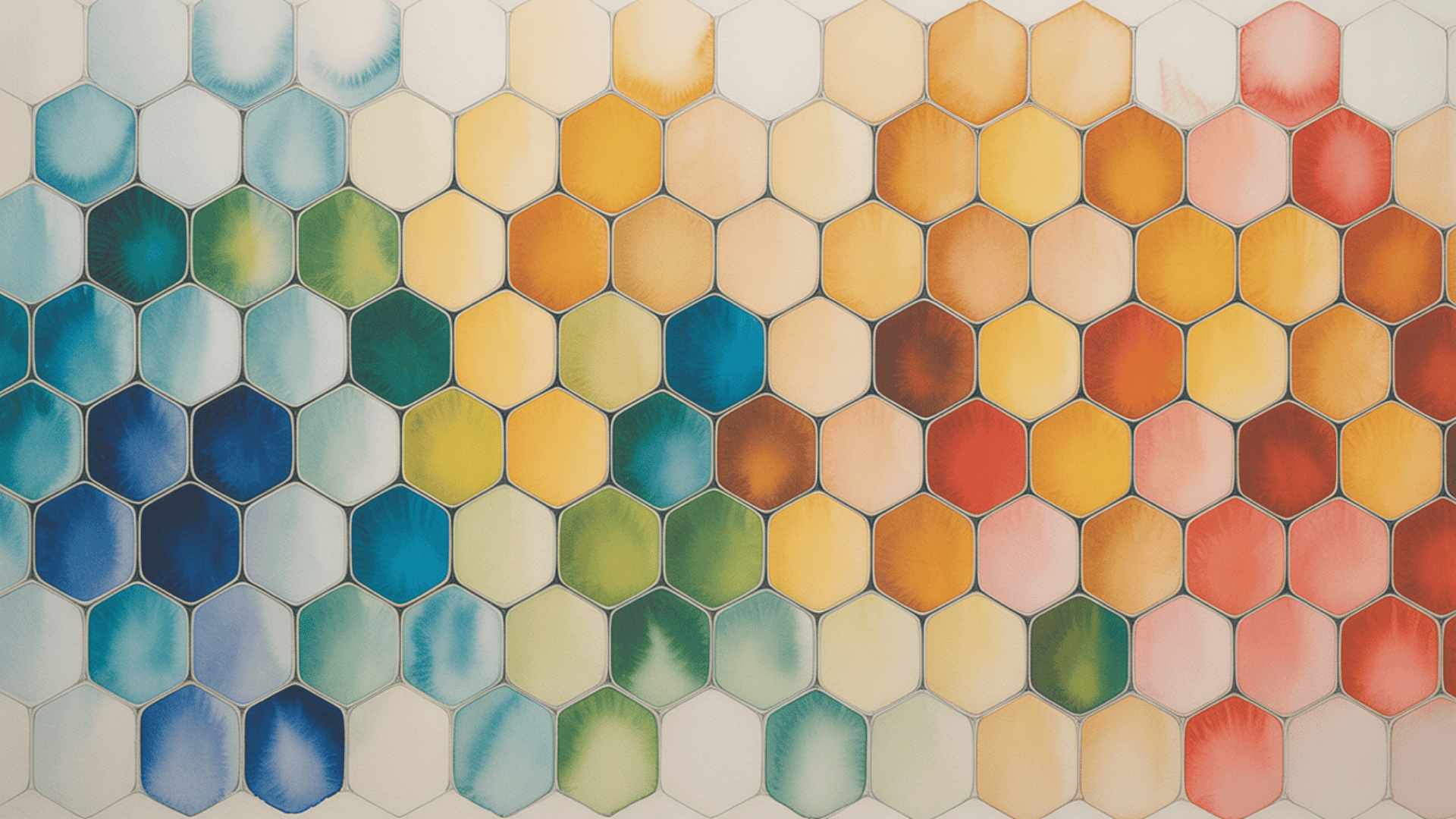
Pattern is the repetition of specific visual elements across a composition. It helps organize surfaces in a consistent and regular manner.
This principle brings a strong sense of order and structure to a piece. It creates predictability, which can be very pleasing to the human eye.
You can find examples of this everywhere in art history. From the intricate tile work in architecture to the background details in a portrait.
Patterns do not have to be identical to work well. Even loose repetition of a shape or color can create a unified texture that ties the work together.
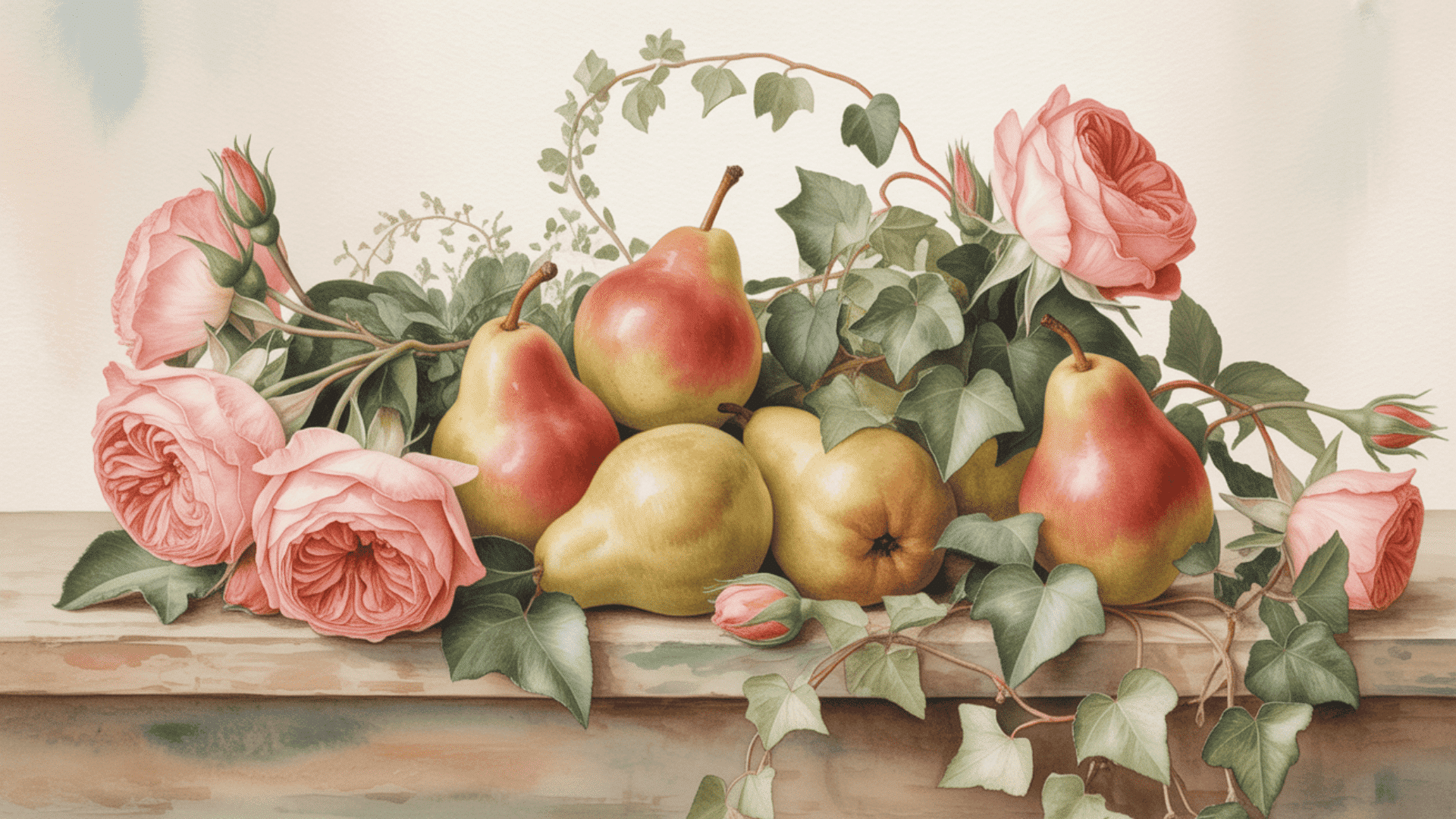
6. Proportion

Proportion refers to the relationship between elements in terms of size and scale. It helps create a sense of realism or harmony within the artwork.
When elements are proportionate, they look like they belong together. This is crucial when drawing the human figure or realistic landscapes.
Scale is a big part of this principle. It involves comparing the size of one object to another to establish depth and distance.
If a hand is drawn larger than a head, it looks wrong to the human eye. However, artists sometimes distort proportion on purpose to create a caricature or a dramatic effect.
Incorrect proportions can feel unsettling. But when used correctly, they anchor the viewer in a believable visual world.
7. Unity
Unity is the goal of every successful composition. It is the feeling that all parts of the artwork are working together as a team.
When a piece has unity, it feels complete and cohesive. It does not look like a random collection of unrelated objects.
This principle relies on the effective use of all the others. Balancing your elements and repeating colors or shapes helps tie everything together.
Consistency in style is also key to achieving unity. If you mix too many different techniques, the artwork might feel disjointed.
Ultimately, unity creates a sense of calm and order. It allows the viewer to see the whole image at once before focusing on the details.
How do the Principles of Art Work Together?
Rarely does an artist use just one principle alone. They are designed to work together to support the artist’s intent.
Think of an orchestra playing a symphony. Unity is the conductor ensuring everyone plays the same song. Emphasis is on the violin soloist stepping forward. Contrast is the difference between the loud drums and the soft flutes.
Movement is how the music flows from one section to the next. All these parts must work in harmony for the result to be beautiful.
For example, in Vincent van Gogh’s The Starry Night, he combines several principles. He uses Movement in the swirling sky lines. He uses Contrast with the bright yellow stars against the deep blue night. And he uses Balance with the large dark tree anchoring the composition.
When these principles interact, they create a stronger impact. They transform simple paint into an emotional experience.
However, even when you understand how these principles collaborate, there is one major concept that trips up almost everyone.
Common Misunderstandings About the Principles of Art
The most common point of confusion for students and beginners is mixing up the elements of art with the principles of art, but there are other myths that can hold you back.
It is easy to assume these concepts are rigid laws or that they are all the same, but they play very different roles in the creative process.
The elements of art are like the ingredients in your kitchen. These are the physical tools you put on the canvas, such as line, shape, color, and texture.
The principles of art act like the recipe. They are the instructions on how to organize those ingredients to create a composition that tastes good to the eye.
Many believe you must use all seven principles in every single artwork. In reality, most successful pieces focus strongly on just two or three, while the others play a supporting role.
Some thinkers view these principles as unbreakable rules. They are actually flexible guidelines that experienced artists often break on purpose to create tension or unease.
You effectively use the principles to arrange the elements into a finished piece. Without the principles, the elements would just be a pile of random items without structure.
Understanding this distinction helps you analyze art better because you can see not just what is there but how it was put together to create meaning.
Conclusion
The principles, including balance, contrast, and unity, are the ultimate toolkit for visual communication.
They transform how you interpret the world around you.
Whether you are analyzing a museum masterpiece or designing a simple social media post, these rules are always at play. By understanding how they function, you move from simply looking at art to truly seeing the intent behind it.
For creators, these principles provide the structure needed to turn a good idea into a great execution. We encourage you to pick up a pencil or a brush today.
Try to consciously apply just one of these principles in your next sketch to see the difference it makes in your composition.