Most artists spend hours perfecting every detail. Then wonder why their finished art still looks flat.
The problem isn’t your skill. It’s composition. You can render perfectly, use color theory, and nail anatomy. But if your composition fails, your art fails. Period.
Good news? Composition isn’t a talent you’re born with. It’s a skill you can build in just 15 minutes a day.
This guide gives you the exact practice methods that actually work. You’ll learn which principles matter most, how to spot weak compositions early, and simple exercises that build your compositional eye fast.
No vague advice like “it should feel right.” Just clear, proven steps that deliver real results.
Ready to fix your compositions? Let’s start.
What is Composition and Why It Matters?
Composition is how you arrange elements in your artwork. Where do you place your subject? How objects relate. What you include or cut.
Strong composition guides your viewer’s eye exactly where you want it. First to your focal point. Then, through the rest of your piece. It creates flow.
Weak composition? Your viewer’s eye bounces randomly. They miss what matters. They scroll past in seconds.
The brutal truth: Basic skills with strong composition beat advanced skills with weak composition. Every single time.
What composition controls:
- Where viewers look first
- How long they stay
- What emotion do they feel
- Whether your message lands
Masters planned their compositions before touching on details. Nothing was accidental. You need this same approach.
Now, let’s break down the exact principles that make composition work.
Core Composition Principles
These are the building blocks. Master these, and your compositions transform.
Every strong composition relies on the same foundational principles. They work across all art styles – realism, abstraction, digital, and traditional. The masters used them. Modern artists use them. You need them too.
Some artists think these are “rules” that limit creativity. Wrong. These are tools that give you control. Once you understand them, you can use them intentionally or break them purposefully. Either way, you’re in charge.
Learn these seven principles. Practice them deliberately. Your compositions will go from confusing to clear, from ignored to captivating.
1. Rule of Thirds
Divide your canvas into nine equal parts. Two horizontal lines. Two vertical lines. Place important elements where these lines intersect.
Why does this work? Perfect center feels static and predictable. Off-center creates tension. Tension keeps eyes moving through your piece.
The four intersection points are your power zones. Placing your focal point on any of these creates instant visual interest. Your subject gets attention without fighting for it.
Horizons work the same way. Place your horizon on the top third for emphasis on the foreground. Bottom third emphasizes sky. Never split your canvas exactly in half unless you want a boring, lifeless composition.
Try this: Take any centered composition you’ve made. Move your main subject to an intersection point. Watch how the entire piece gains energy.
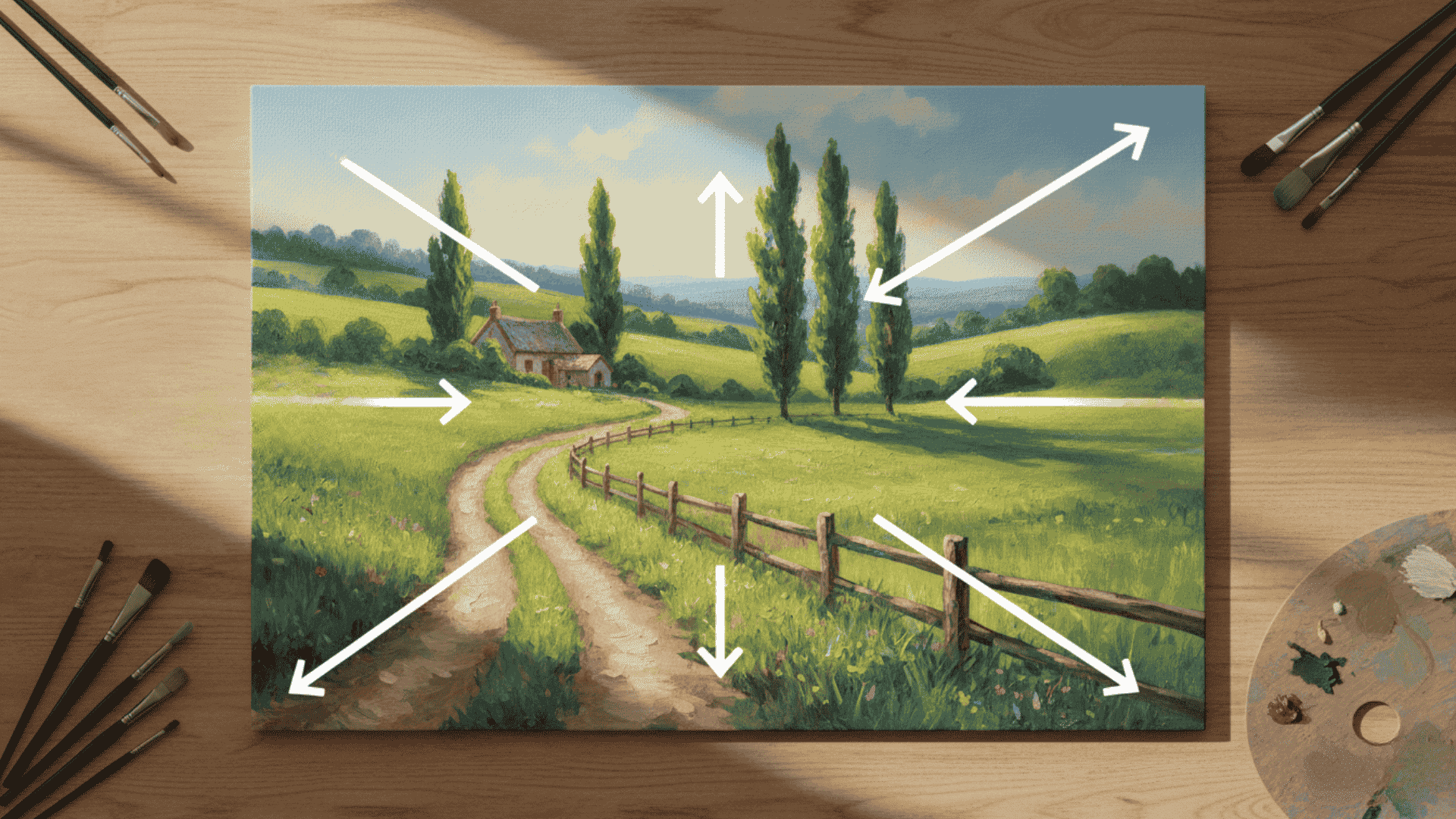
2. Balance
Balance doesn’t mean symmetrical. It means visual weight feels distributed properly across your canvas.
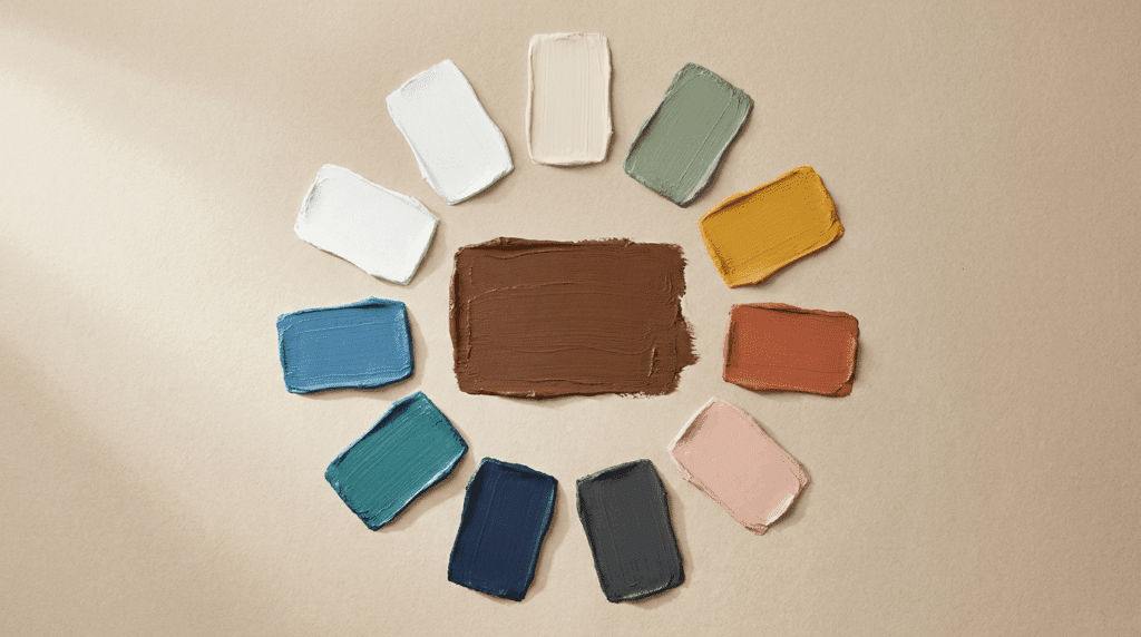
Visual weight comes from multiple factors. Large objects feel heavy. Dark values feel heavy. Warm colors feel heavy. Great detail feels heavy. Small objects, light values, cool colors, and simple areas feel light.
You can balance one large dark shape on the left with three small light shapes on the right. You can balance a detailed, busy area with calm negative space. The weights don’t need to match exactly. They need to feel stable.
Symmetrical balance creates calm, formal, serious moods. Think religious art or government buildings. Asymmetrical balance feels more natural, more dynamic, and more interesting for most artwork.
Test it: Squint at your art until details blur. Does one side or corner feel too heavy? Does your composition feel like it might tip over? Adjust the visual weight until it feels stable but not boring.
3. Focal Point
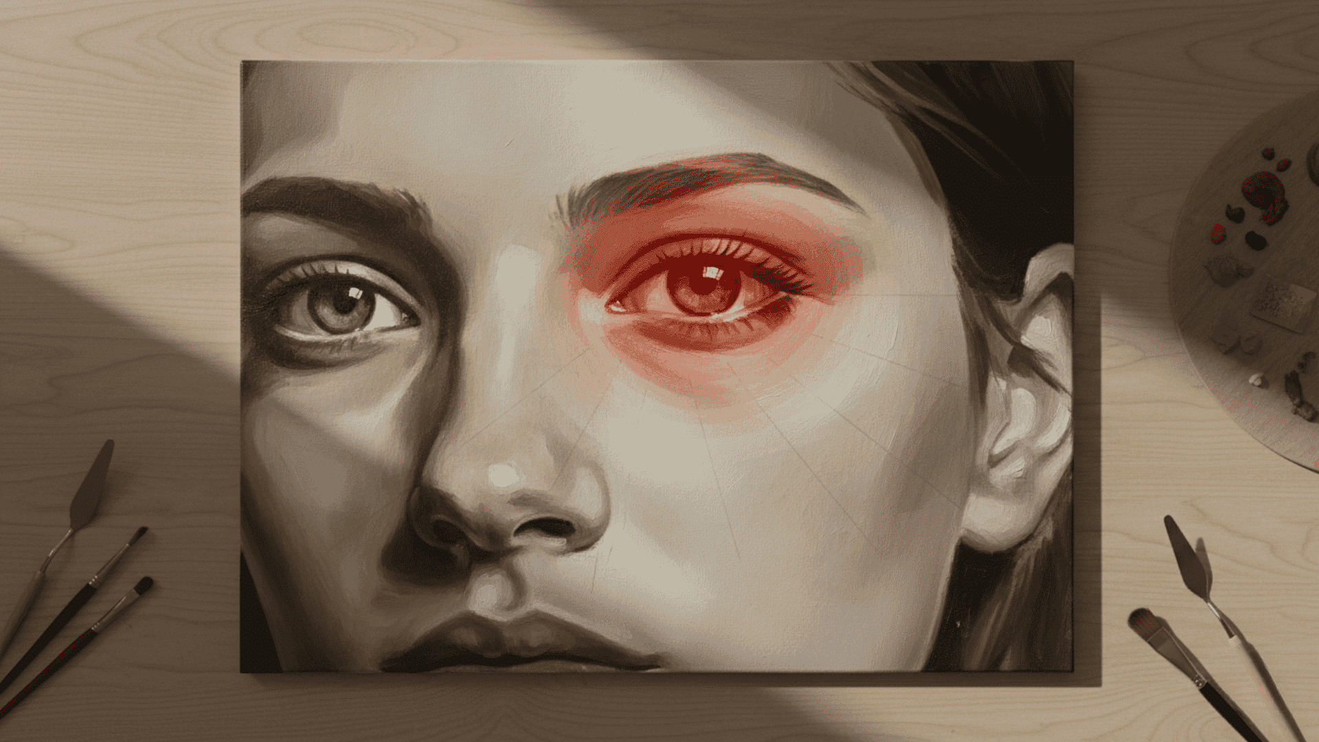
Your viewer needs one clear place to look first. That’s your focal point. Without it, eyes wander aimlessly, and viewers lose interest fast.
Make your focal point impossible to miss through:
- Highest contrast between light and dark
- Sharpest, clearest edges
- Most detail and refinement
- Brightest or most saturated color
- Where all the leading lines converge
Only one main focal point per piece. Two focal points split attention. Your viewer’s eye fights between them, never settling. Three or more? They give up and scroll past.
Secondary focal points can exist, but they must be clearly subordinate. Less contrast. Less detail. Less intensity. They support your main focal point, never compete with it.
Common mistake: Making everything equally detailed and vibrant. This creates visual noise with no focus. Pick your star. Let everything else play supporting roles.
4. Leading Lines
Lines guide eyes through your composition like roads on a map. They can be actual lines you draw or implied lines your viewer’s brain creates.
Actual lines: Edges of objects. Paths and roads. Tree branches. Architectural elements like railings or rooflines. Anything with a clear linear direction.
Implied lines: Where figures are looking. The direction someone is pointing. Patterns that repeat in a direction. Alignment of separate objects that your brain connects.
Diagonal lines create the most energy and movement. They feel dynamic and active. Horizontal lines feel calm, stable, and restful. Vertical lines feel strong, tall, and imposing.
Use lines strategically. Roads, rivers, fences, and extended arms all point your viewer exactly where you want them. Lead them from your entry point through the composition to your focal point.
5. Negative Space
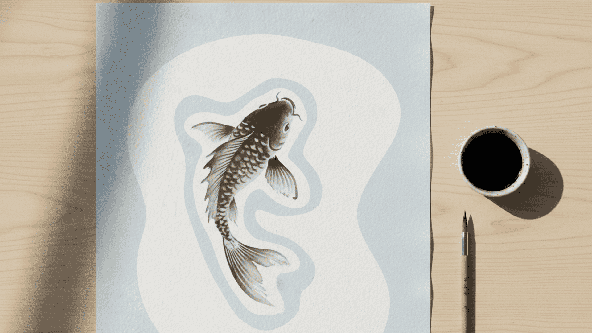
The empty areas around and between your subjects. Most beginners pack every inch with stuff. Big mistake.
Negative space isn’t wasted space. It gives your subject room to breathe. It creates rest areas where your viewer’s eye can pause before moving on. It can form shapes just as interesting as your positive shapes.
Good negative space has intentional, clean shapes. Bad negative space creates awkward, random shapes that distract without adding value.
Asian art masters this. Look at traditional Japanese paintings. They use vast areas of empty space to make the subject feel more powerful, not less.
Western artists often fear empty space. They fill it with unnecessary detail. The result? Cluttered, overwhelming compositions where nothing stands out.
Check this: Trace only your negative space shapes on a separate piece of paper. Are they interesting and intentional? Or boring, awkward, and accidental? Good negative space passes this test.
6. Contrast
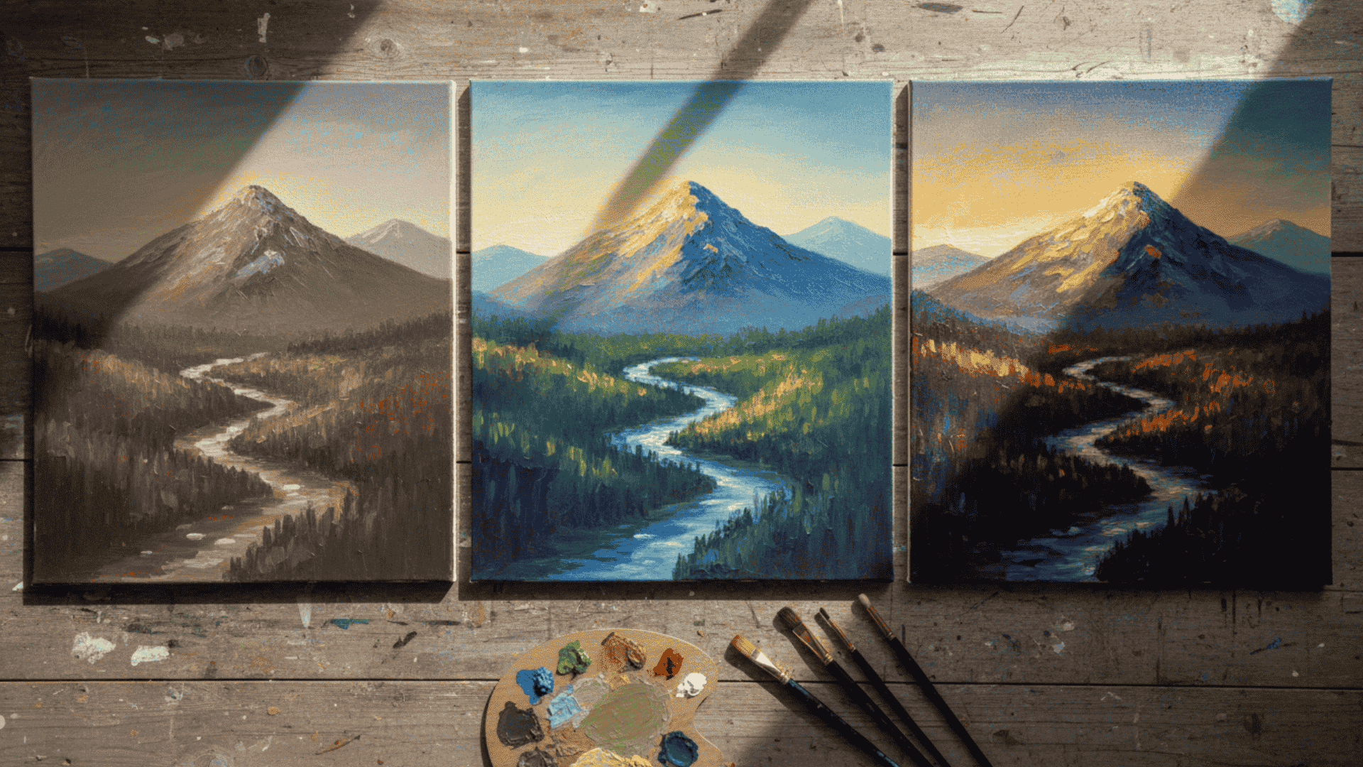
Difference creates interest. Light against dark. Rough against smooth. Large against small. Busy against calm.
Contrast is your attention magnet. The human eye can’t help but look at the spot with the strongest contrast first. This is biology, not opinion.
Your strongest contrast must be at your focal point. Period. Everywhere else? Reduce contrast gradually. This creates a clear hierarchy. Your viewer knows instantly where to look.
No contrast? Your art looks flat, muddy, and boring. Everything blends together. Nothing stands out. Too much contrast everywhere? Your art looks chaotic, overwhelming, and exhausting to view.
The sweet spot: Maximum contrast at your focal point. Medium contrast in secondary areas. Low contrast in backgrounds and supporting elements.
7. Visual Hierarchy
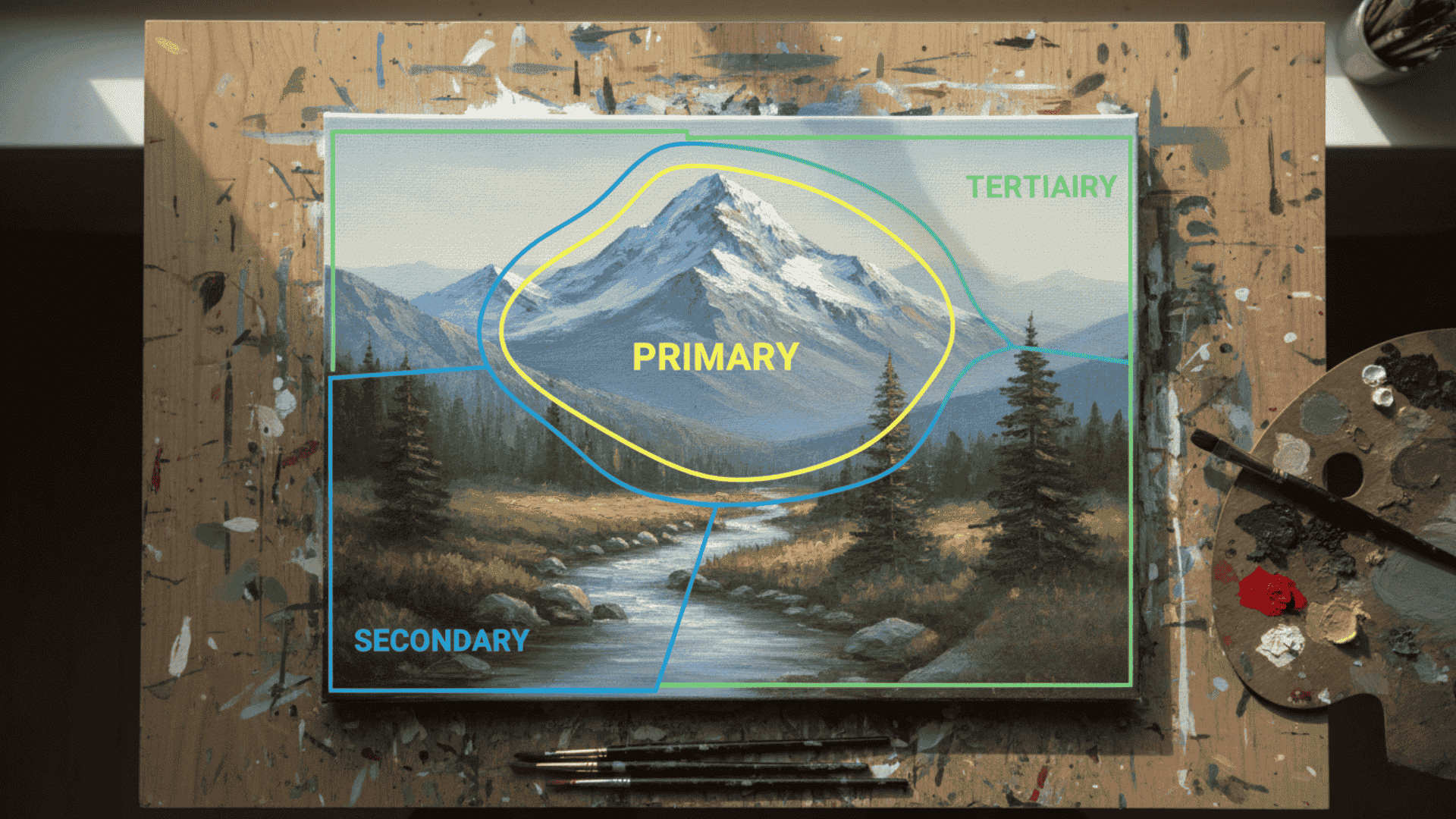
Not everything in your composition deserves equal attention. Rank your elements by importance and treat them accordingly.
Primary elements: Your focal point and immediate surroundings. These get maximum detail, contrast, color intensity, and refinement. Viewers should spend 60-70% of their time here.
Secondary elements: Supporting shapes and objects. These get moderate detail and contrast. They add context and guide the eye toward your focal point. Viewers spend maybe 20-30% of their time here.
Tertiary elements: Background details and atmospheric elements. These get minimal detail, low contrast, and muted colors. They fill space and provide context without demanding attention. Viewers barely notice them consciously, but they complete the scene.
Use size, contrast, detail level, and placement to create this hierarchy. Your focal point should be obviously more important than everything else. Not by a little. By a lot.
When you treat everything equally, nothing stands out. When you create a clear hierarchy, your composition guides viewers effortlessly through exactly the experience you intend.
Understanding these principles is step one. Actually, training your eye to use them automatically? That takes deliberate practice. Let me show you exactly how to build this skill with exercises that actually work.
Step-by-Step Practice Exercises
Knowing the principles means nothing without practice. These exercises train your compositional eye fast.
Theory doesn’t rewire your brain. Deliberate practice does. These exercises target specific skills. Some take 10 minutes. Others 30. Do them regularly, and compositional decisions become automatic.
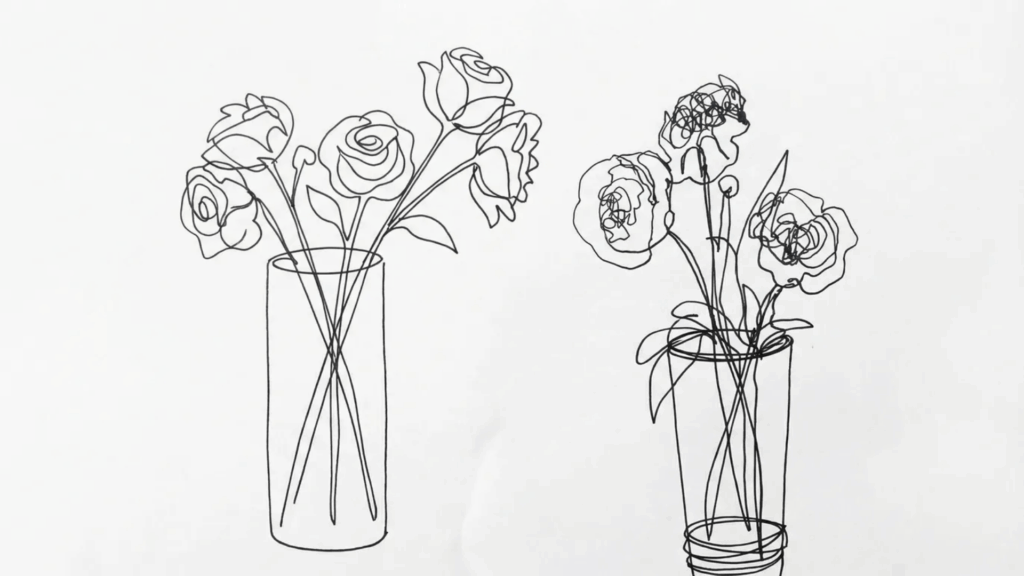
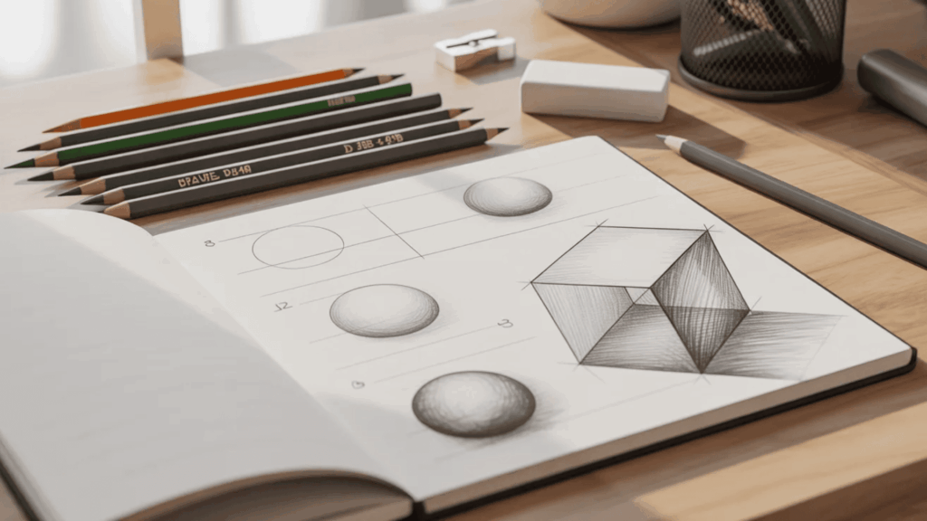
1. Thumbnail Sketches
Draw five tiny rough sketches before any finished piece. Two inches tall maximum. No detail. Just shapes and values.
Test different focal point placements. Try various arrangements. Two minutes per thumbnail. Pick the strongest composition before committing to the final art.
Do this daily for two weeks. Your eye will start seeing possibilities automatically.
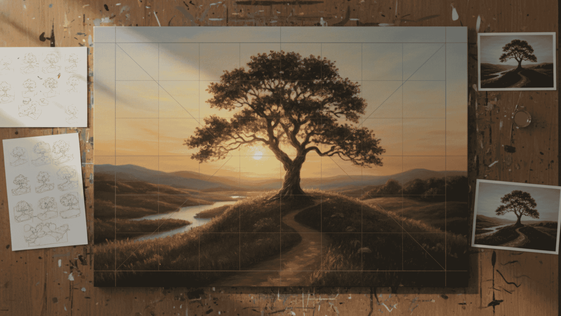
2. Master Study
Pick a famous painting. Study its composition for 10 minutes. Where’s the focal point? What lines lead your eye? How is weight balanced?
Recreate just the compositional structure. No details. Just basic shapes and values. Simplify to light, medium, and dark.
One master studies weekly. After 20 studies, strong structure becomes intuitive.
3. Negative Space Exercise
Take any photo reference. Draw only the negative space shapes. Ignore the subject completely.
This flips your perspective. You’ll see awkward shapes you missed before.
Three times weekly. After a month, you’ll naturally see negative space while composing.
4. Value Sketch Practice
Sketch any subject using only three values. Light, medium, dark. No gradients. Hard edges only.
Forces clarity. Your focal point must have strongest contrast. Your composition must work without detail.
15 minutes daily for 30 days. You’ll compose with value structure from the start.
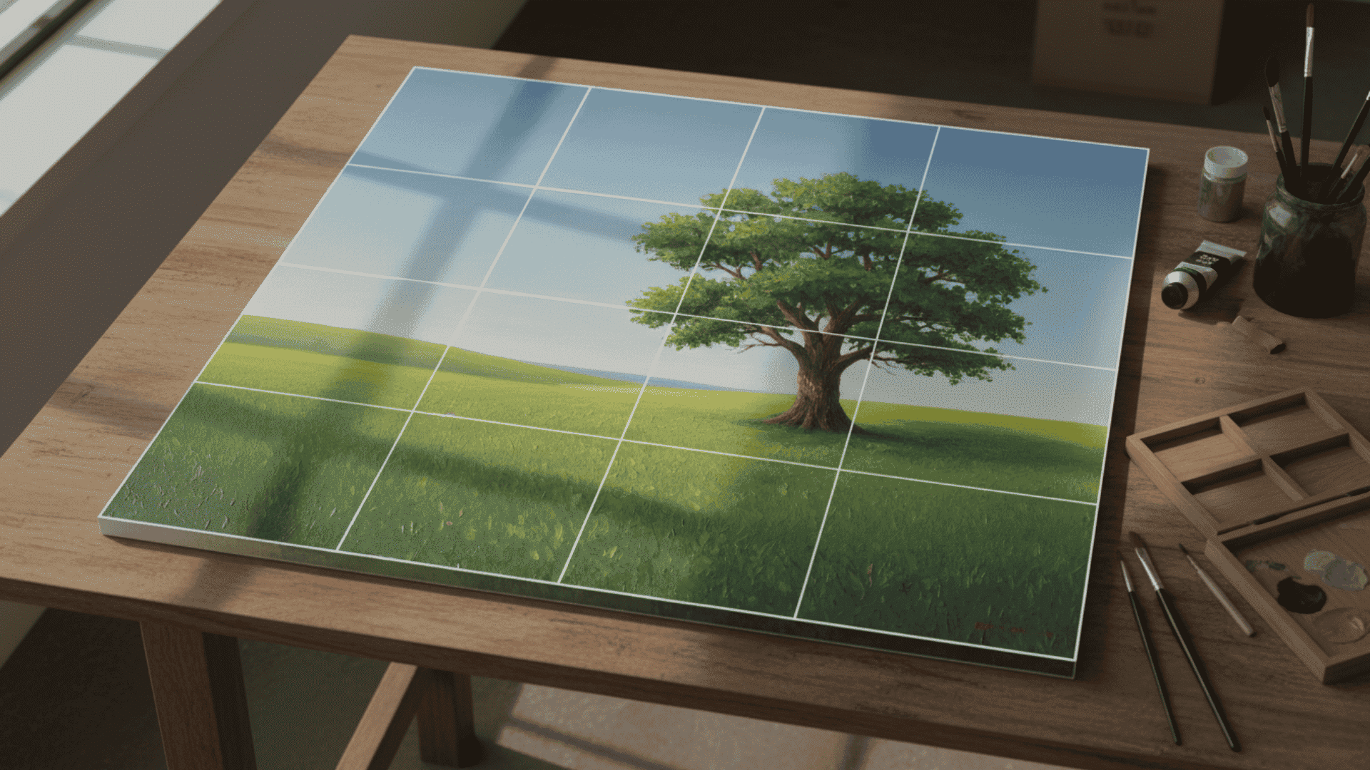
5. Cropping Exercise
Take one photo. Find 10 different strong compositions within it by cropping.
Use a viewfinder or paper frame. Try vertical, horizontal, and square crops. Each creates different focal points and balance.
Weekly practice. You’ll find compositions everywhere.
6. Shape Arrangement
Cut five to eight random shapes from black paper. Arrange them on white paper.
Move them around. Try dozens of arrangements. No subject. Just pure visual balance.
This isolates composition from drawing skill. The arrangement either works or it doesn’t.
Weekly practice strengthens all your art.
7. Timed Variation Studies
Set a timer for 20 minutes. Create three different compositions of the same subject. Rough sketches only.
First: Whatever comes naturally. Second: Force something completely different. Third: Combine the best parts.
Three times weekly. Speed builds instinct.
These exercises work because they train your eye deliberately. Pick two. Do them consistently for one month. Your compositions will improve dramatically.
But practice only helps if you avoid common mistakes. Let me show you the biggest composition errors and exactly how to fix them.
Common Mistakes and How to Fix Them
Even good artists make these compositional errors. Spot them early, and your work improves instantly.
- Centering Everything: Dead center feels static. Move your focal point to a rule of thirds intersection for tension and interest.
- Ignoring Negative Space: Packing every inch overwhelms viewers. Leave intentional empty space. It makes your subject stronger.
- Multiple Focal Points: Two strong focal points confuse viewers. Pick one. Give it maximum contrast and detail. Everything else supports it.
- Equal Detail Everywhere: Same detail level creates visual noise. Most detail at the focal point. Less detail everywhere else.
- Poor Value Structure: Squint at your work. See clear light and dark shapes? If everything looks gray, strengthen your values. Strongest contrast at the focal point.
- Tangents: Edges barely touching confuse spatial relationships. Overlap clearly or separate clearly. No ambiguous contact.
- No Leading Lines: Create paths for eyes to follow. Use roads, branches, edges, or where figures look. Guide viewers to your focal point.
- Skipping Thumbnails: Test five quick sketches before starting. Two minutes each. Saves hours of fixing later.
- Copying Reference Exactly: Your photo might have a bad composition. Move elements. Change crops. Improve what the camera captured.
- Overcomplicating: Too much happening dilutes impact. Remove anything that doesn’t support your focal point. Less is more.
Use this checklist to catch these errors before finishing your work.
Conclusion
Strong composition separates amateur work from professional art. You now have the principles, exercises, and troubleshooting tools to build this skill.
Composition isn’t mysterious. It’s not talent you’re born with. It’s trained observation that improves with deliberate practice. Every master artist you admire practiced these same fundamentals repeatedly. The difference between you and them? They put in the hours.
Your compositions will transform faster than you expect. Fifteen minutes of focused practice beats hours of random experimentation.
Your next step: grab your sketchbook and create five thumbnail compositions right now. Any subject. Two minutes each. Start training your eye today, not tomorrow.
Better compositions are waiting. Go make them.