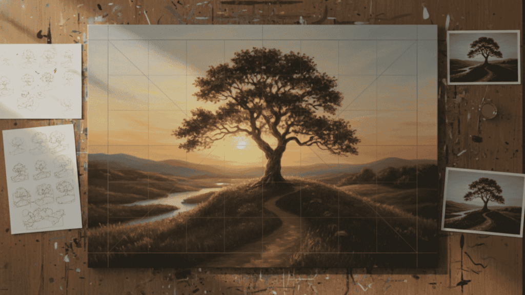
Have you ever stood before a masterpiece and felt your eyes dancing across the canvas, discovering new secrets in every corner?
That magnetic pull is rarely accidental. It is the result of a powerful design principle known as variety.
In the art world, variety acts as the spice that prevents a composition from feeling flat. It is the intentional use of contrasting elements like shifting colors, diverse textures, or unexpected shapes to create a sense of visual complexity.
Without it, even the most beautiful work can feel monotonous and lose the interest of a viewer within seconds. By mastering variety, artists can guide our gaze and spark our curiosity.
Join us as we explore how this essential principle transforms images into captivating experiences that breathe with life and energy.
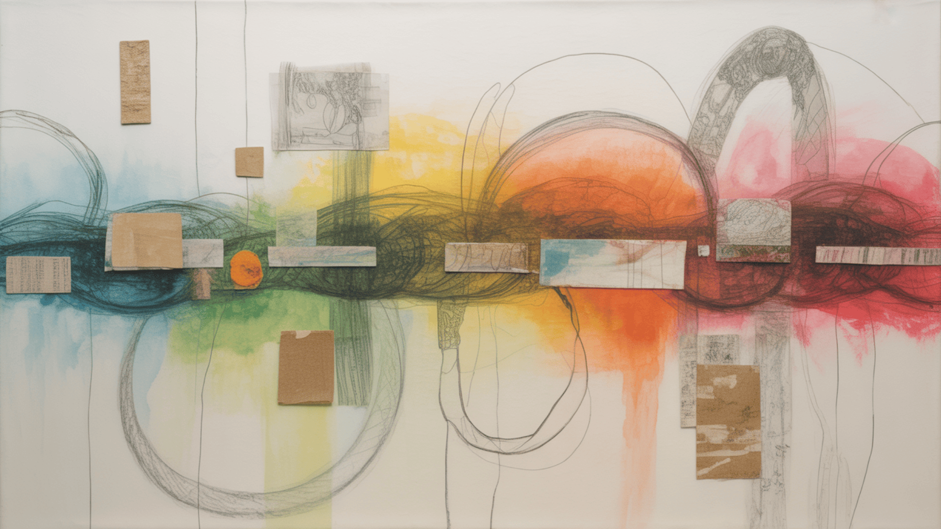
What Is Variety in Art?
Variety is a fundamental principle of design that uses differences in visual elements to create interest and complexity within a composition.
Essentially, it is the art of making certain parts of a piece stand out from others to keep the viewer curious.
While a unified piece feels organized, variety provides the spark that prevents it from appearing static or dull.
By introducing diverse colors, shapes, or textures, an artist creates a dynamic environment that promotes visual engagement.
Instead of processing the entire image in a single glance, the human brain begins to seek out these differences. This process keeps the eyes moving and allows the viewer to discover new details over time.
In terms of composition, variety ensures the design is not just a series of repeated patterns but a rich landscape of contrasting ideas. It is the tool that transforms a simple layout into a deep and multilayered experience.
Variety as a Design Principle
Variety does not work in isolation. It is part of a larger family of principles that artists use to organize their work and communicate ideas.
While variety provides excitement, it must work alongside other concepts like unity, contrast, emphasis, and movement to be effective.
The most important relationship is between variety and unity. If unity is the glue that holds a piece together, variety is the spice that makes it interesting. Contrast is the primary tool used to achieve variety, as it highlights the differences between two things, such as a rough texture next to a smooth one.
Variety also creates emphasis by making specific areas stand out. When one part of a painting looks different from the rest, it naturally becomes a focal point.
This diversity of elements also encourages movement. It guides your eyes from one unique detail to the next, ensuring you explore the entire canvas.
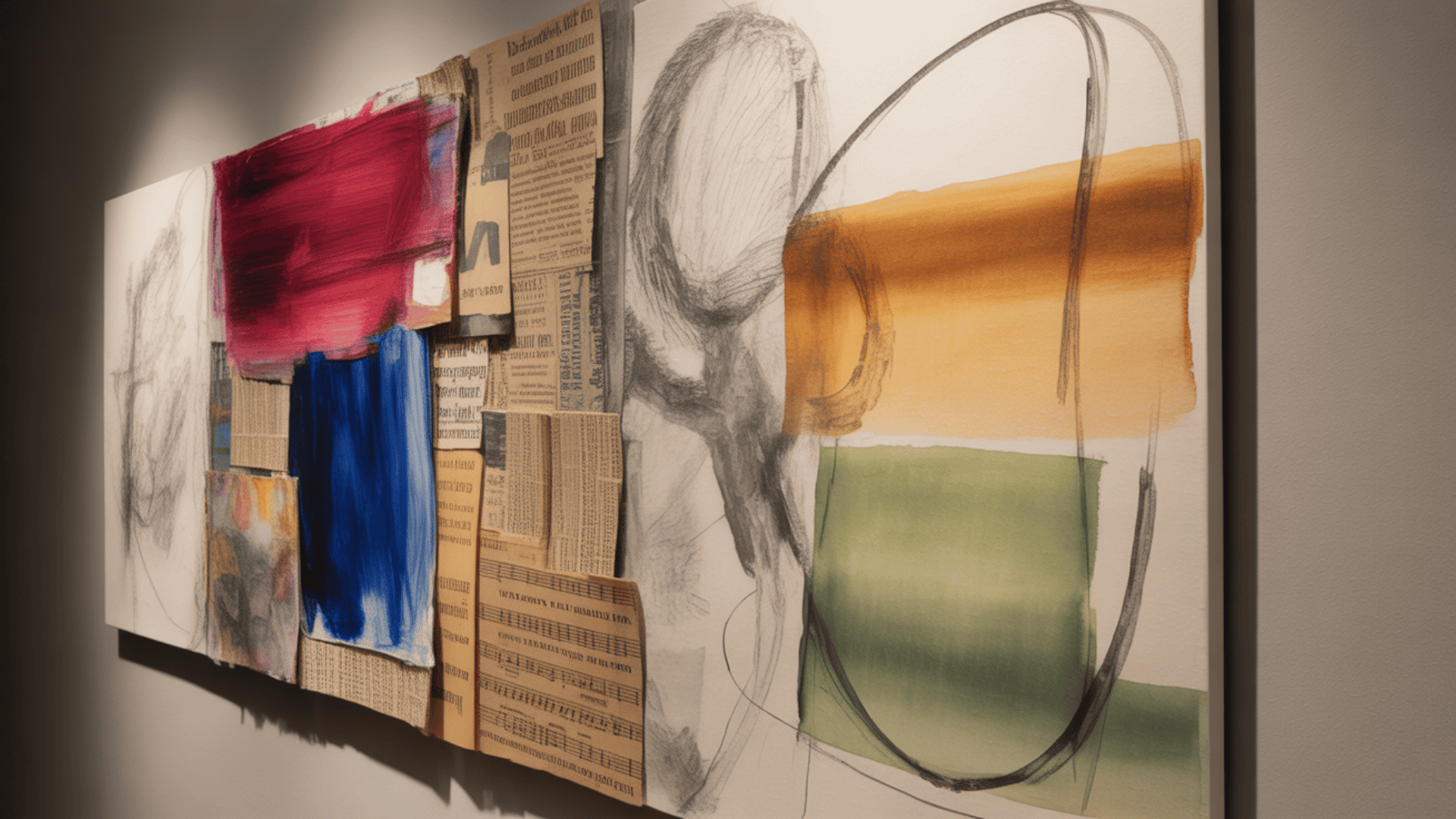
The Elements of Art That Create Variety
Artists use five main elements to create variety in their work. Each element offers different ways to add visual interest. Understanding these elements helps you see how artists keep their work from looking flat or boring.
You can use one element or combine several together. The key is knowing when and how to apply each type effectively.
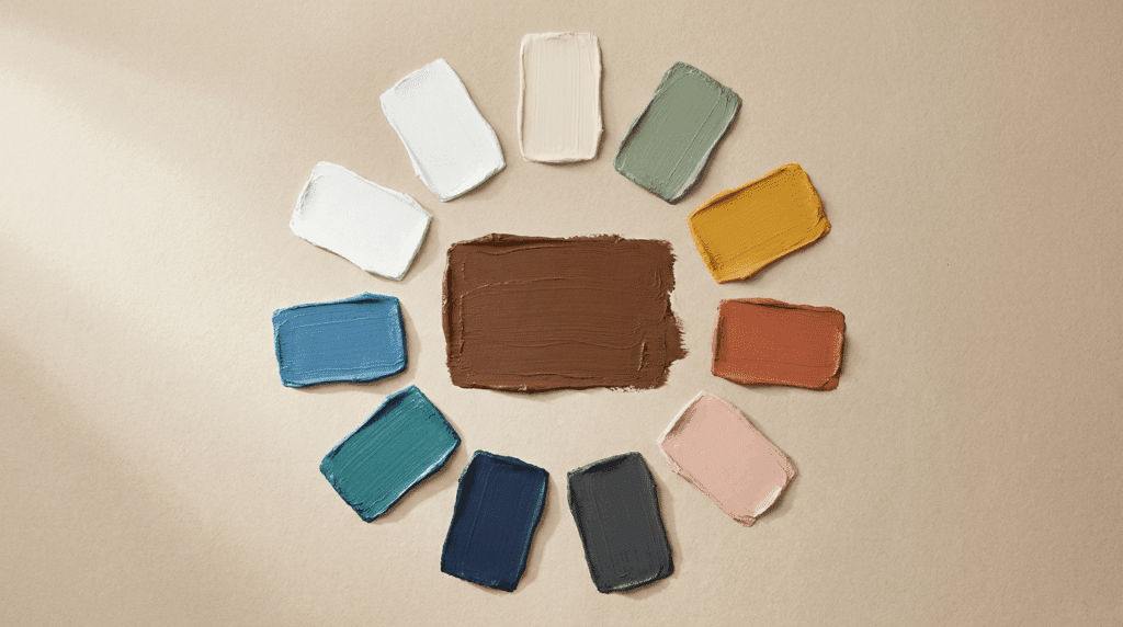
1. Color Variety: Using Contrasting Hues and Tones
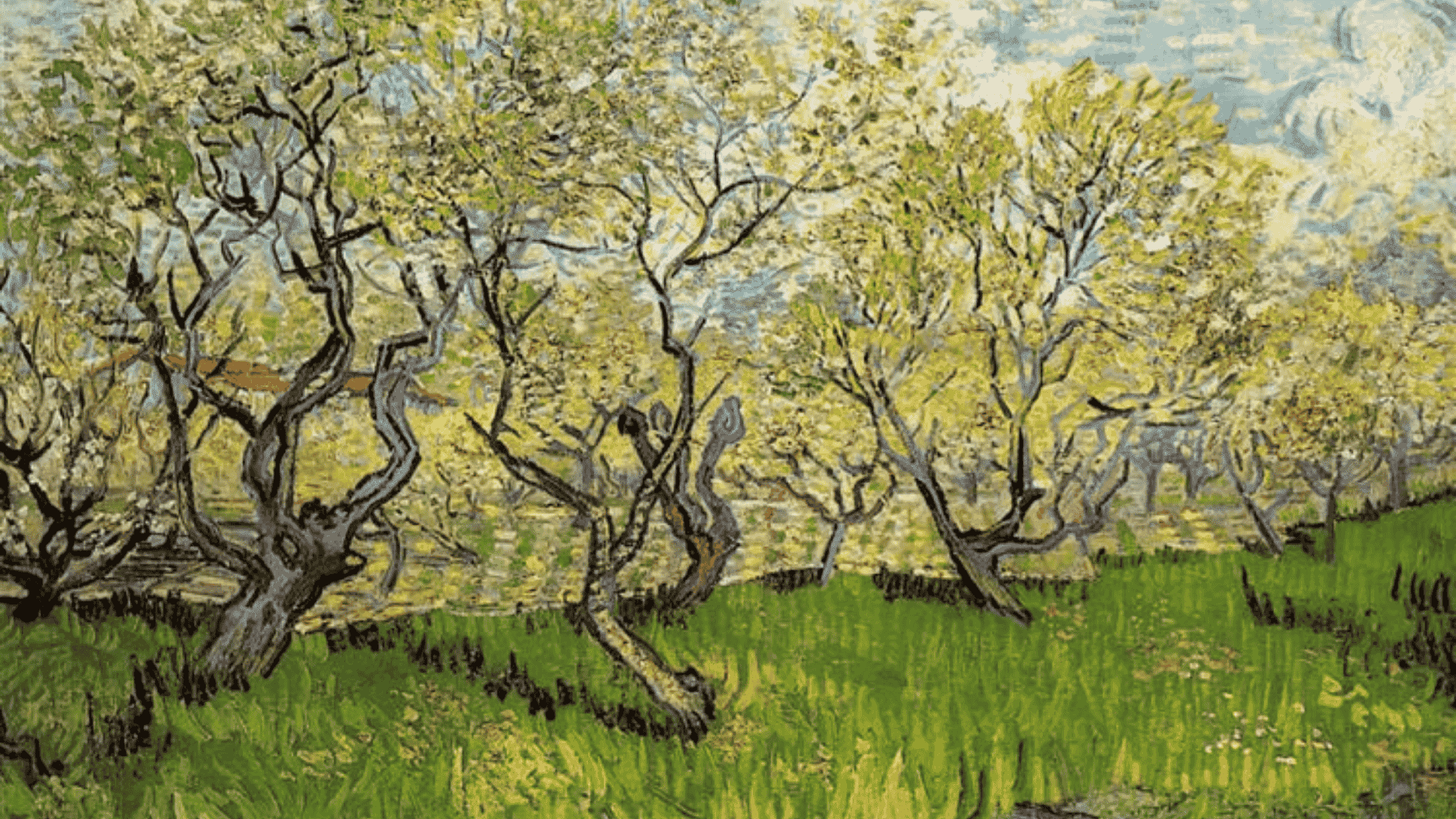
Orchard in Blossom-Vincent van Gogh
Color is one of the easiest ways to add variety to artwork. You can change three aspects: hue, value, and saturation. Hue means the color itself, like red or blue. Value refers to how light or dark a color appears.
Saturation is the intensity or vividness of a color. Warm colors like red and orange contrast with cool colors like blue and green. Complementary colors sit opposite each other on the color wheel and create the strongest contrast.
Example: Vincent van Gogh’s “Orchard in Blossom” uses red and green complementary colors in the grass. The colors contrast sharply, yet the painting still looks unified. Van Gogh kept the color scheme simple with just those two colors and their variations.
2. Line Variety: Changing Weight, Direction, and Type
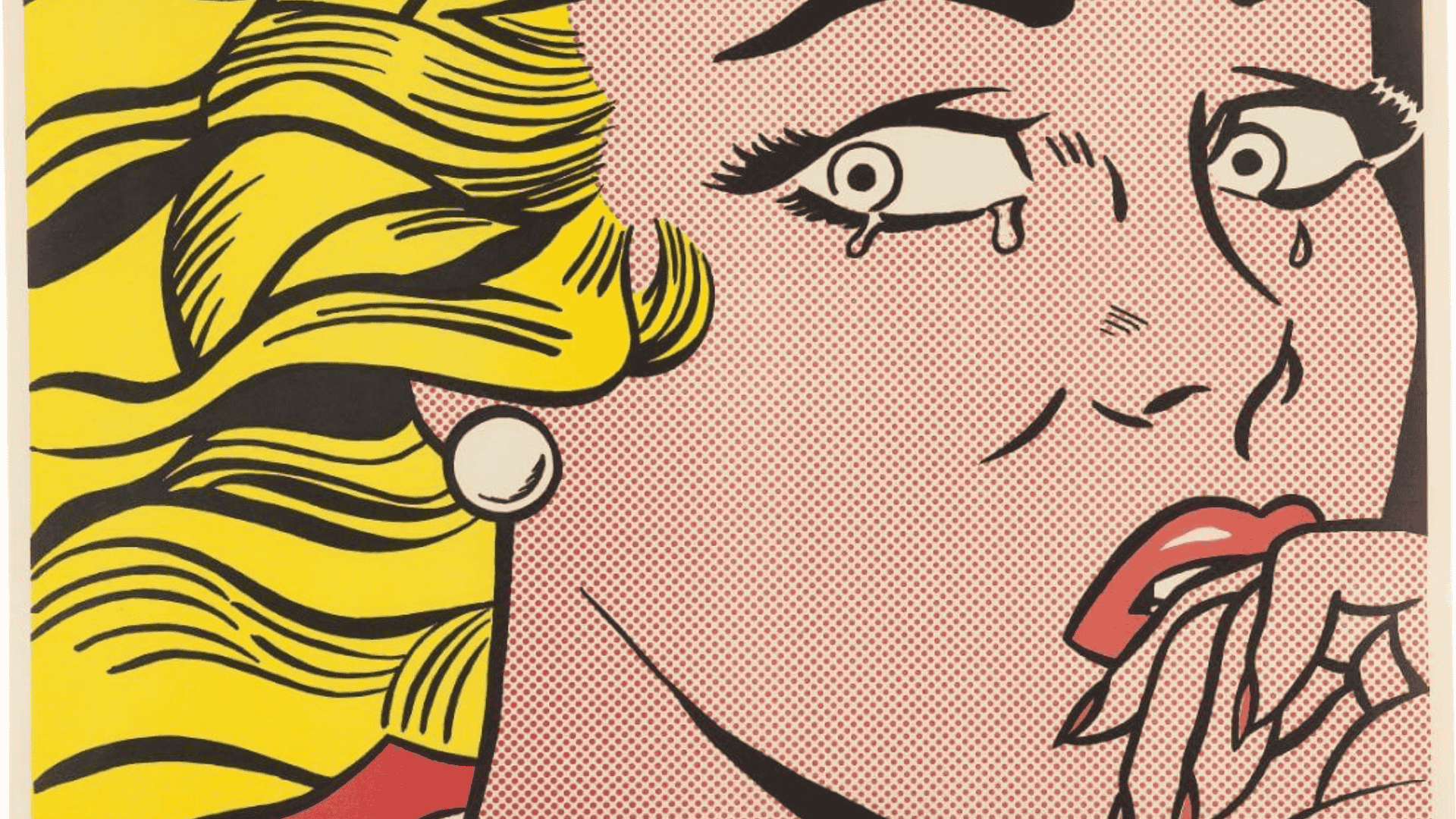
Crying Girl-Roy Lichtenstein
Lines can vary in weight, length, direction, and quality. Line weight means thickness. Thick lines feel bold while thin lines feel delicate. Line direction affects mood throughout the composition.
Horizontal lines suggest calm and stability. Vertical lines show strength and growth. Diagonal lines create energy and action. Curved lines add grace and flow to the piece.
Line quality refers to how the line looks. Is it smooth or rough? Straight or wobbly? Mixing different line types keeps compositions interesting and guides the viewer’s eye.
Example: Roy Lichtenstein’s “Crying Girl” shows excellent line variety throughout. He used short choppy lines at the top of the head. Behind the head, those lines get smaller and more refined.
Some areas have curved lines, while others have thick geometric lines. The variety creates visual interest in every section of the artwork.
3. Shape and Form Variety: Mixing Geometric and Organic
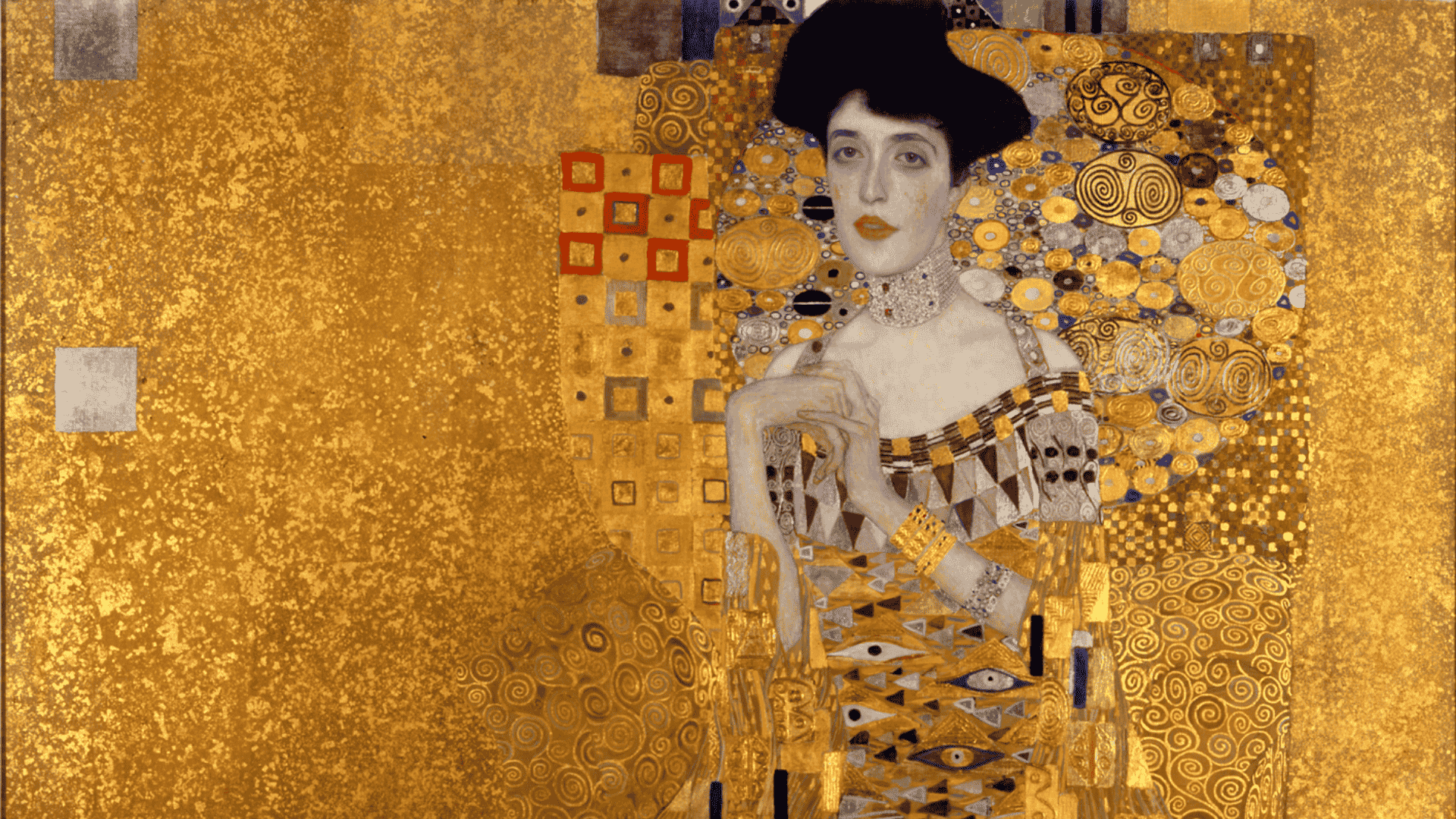
Portrait of Adele Bloch-Bauer I– Gustav Klimt
Shapes fall into two categories: geometric and organic. Geometric shapes are mathematical and precise, like circles, squares, and triangles. They feel ordered and structured throughout a composition.
Organic shapes are free-form and natural, like clouds or leaves. They feel more relaxed and flowing in contrast. Size variety matters too when working with shapes.
Use large shapes and small shapes together in the same piece. Put simple shapes next to complex ones. This creates visual tension that holds attention throughout the artwork.
Example: Gustav Klimt’s “Portrait of Adele Bloch-Bauer I” mixes both types perfectly. The dress has flowing, organic lines that move gracefully. But the dress details use sharp geometric patterns and shapes. The contrast between these two shape types makes the painting more interesting to view.
4. Texture Variety: Creating Surface Interest
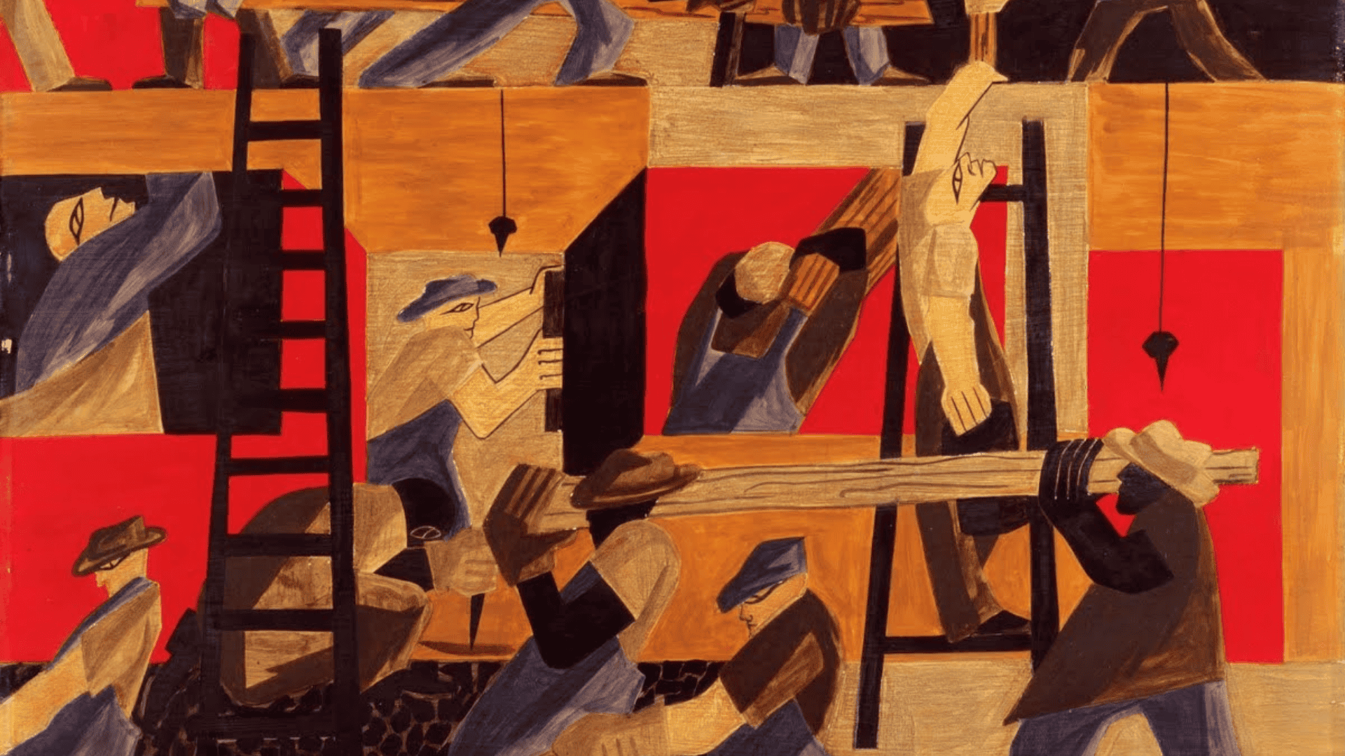
The Builders– Jacob Lawrence
Texture can be actual or implied in artwork. Actual texture is physical, and you can touch it. Implied texture is visual and looks textured, but feels smooth.
Artists create texture variety by changing their paint application across different areas. Some areas might have thick, rough brushstrokes that stand out. Other areas stay smooth and flat for contrast.
Different tools create different textures throughout a piece. Brushes make varied stroke patterns depending on how you use them. Palette knives create smooth or ridged surfaces. Mixing smooth and rough areas makes both sections more noticeable and adds depth.
Example: Jacob Lawrence used texture variety effectively in his work. His figures appear opaque and solid with consistent paint application. The background has transparency, where you can see layers of paint underneath. This texture contrast adds depth and visual interest to the composition.
5. Value and Space Variety: Light, Dark, and Depth
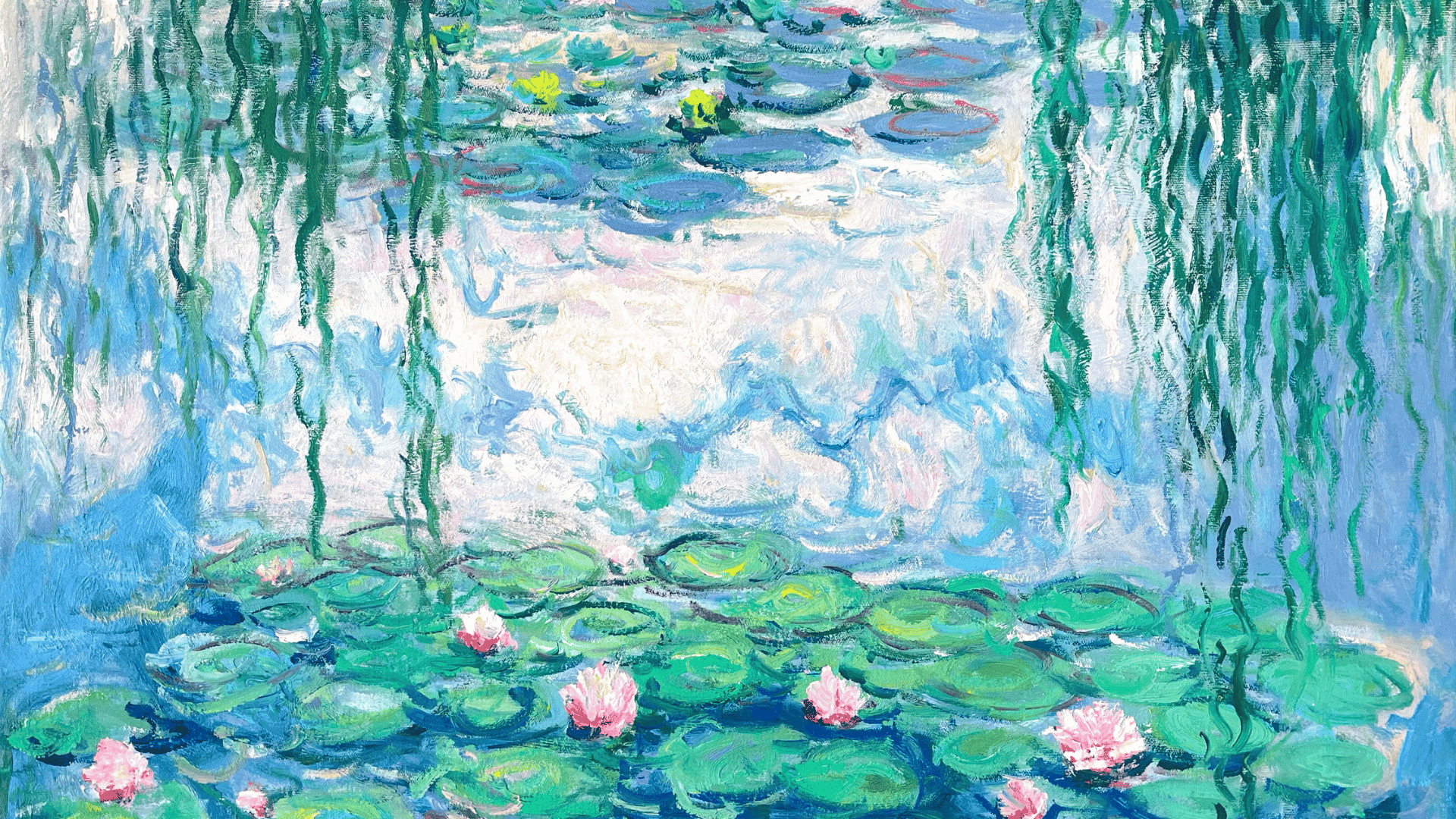
Water Lilies– Claude Monet
Value variety means using a range from very light to very dark. This creates depth and guides the eye through the composition effectively. You can vary how values transition throughout different areas.
Some areas shift gradually from light to dark with smooth transitions. Other areas change abruptly with hard edges between values. Both approaches work when mixed together in one piece.
Space variety refers to how you arrange positive and negative space. Positive space is where objects are located in the composition. Negative space is an empty area that gives the eye room to rest. Vary the sizes of your spaces to create breathing room and prevent crowding.
Example: Claude Monet’s work shows strong value variety in many paintings. He used shadowed trees in the foreground that appear very dark. The background stays light and bright with high-key colors. This value contrast creates depth and draws the viewer into the scene.
Understanding the elements is just the first step. Now let’s explore the specific techniques artists use to create variety in their compositions. These methods help you apply variety in practical and purposeful ways.
Types and Techniques of Variety
Artists use three main types of variety: contrast, change, and elaboration. Each technique serves a different purpose in creating visual interest. You can use one technique or combine several for maximum impact.
1. Contrast: Creating Stark Differences
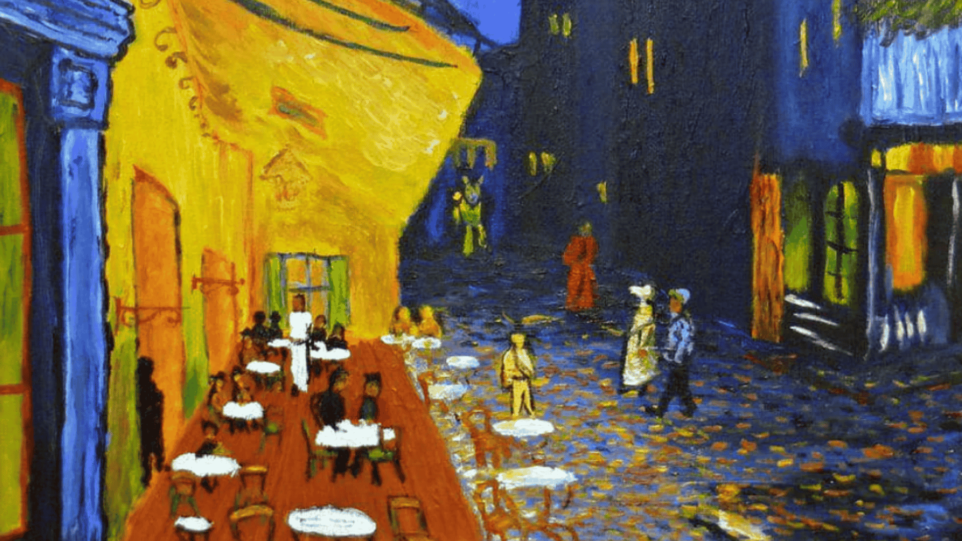
Café Terrace at Night– Vincent Van Gogh
Contrast uses stark differences between elements to grab attention. This technique places opposites next to each other for maximum impact. Warm colors sit next to cool colors. Large shapes appear beside small shapes.
Light values contrast with dark values throughout the composition. Smooth textures oppose rough textures in different areas. Straight lines meet curved lines to create tension.
The differences are obvious and immediate to the viewer’s eye. Contrast makes certain elements stand out more than others. This technique is powerful for creating focal points.
Example: Vincent van Gogh’s “Café Terrace at Night” uses strong color contrast. The bright yellow-orange of the café glows against the deep blue night sky. This warm versus cool contrast draws your eye straight to the café. The painting would feel flat if van Gogh had used only blue tones throughout.
2. Change and Difference: Modifying Repeated Elements
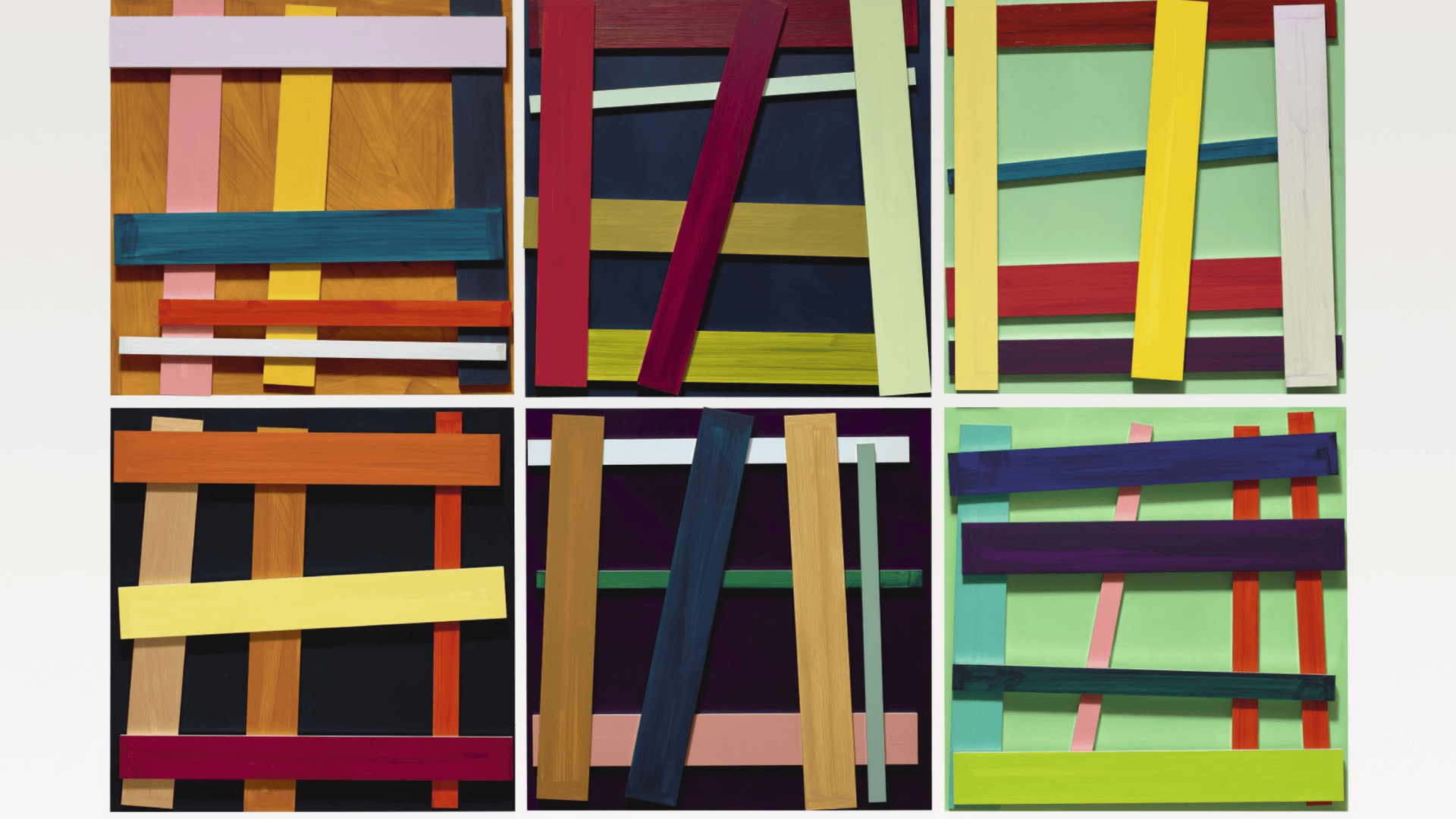
Artwork by Imi Knoebel
Change and difference mean repeating similar elements but altering one aspect. You might keep the same shape but change its size. Or use the same color but vary its saturation or value.
This technique is more subtle than stark contrast. The elements look related but different enough to stay interesting. You can change position, hue, size, or intensity of repeated elements.
This approach maintains unity while adding variety to the composition. The viewer sees the connection between elements but notices the variations. It creates rhythm and movement across the artwork.
Example: Imi Knoebel’s contemporary work uses repeated rectangular shapes throughout. Each rectangle is the same shape and roughly the same size. But he varies the color of each rectangle from bright to muted tones. The repetition creates unity while the color changes add visual interest.
3. Elaboration: Adding Detail and Complexity
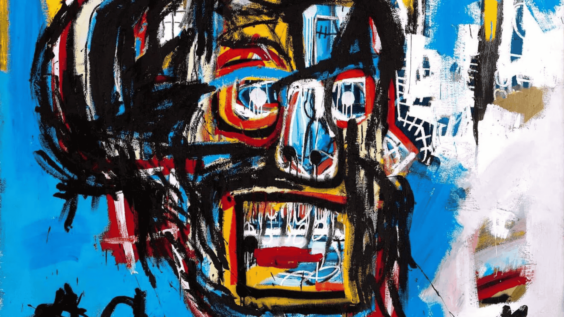
Untitled- Jean-Michel Basquiat
Elaboration means adding extra details and complexity to increase interest. You start with a basic element, then build upon it. This technique adds richness and depth to your work.
Think of decorative patterns added to simple shapes. Or intricate textures layered on flat surfaces. Details in some areas, while other areas stay simple.
Elaboration works best when used selectively throughout a composition. Too much detail everywhere can overwhelm the viewer. Balance detailed areas with simpler sections for breathing room.
Example: Ancient handwritten scripts used elaborate capital letters at the start of sections. The first letter had intricate patterns and decorative flourishes. The rest of the text stayed simple and easy to read. This elaboration drew attention to new sections while maintaining readability.
4. Additional Techniques
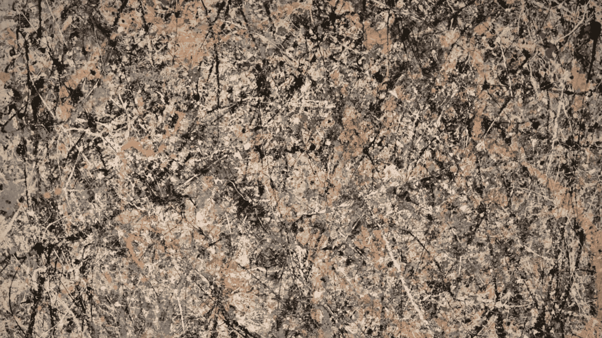
Number 1 (Lavender Mist)– Jackson Pollock
Beyond the three main types, artists use additional techniques to create variety. These methods add extra layers of visual interest to compositions.
Juxtaposition: Places contrasting elements directly next to each other. You might put organic shapes beside geometric ones. Busy patterns sit next to empty space. The placement creates visual tension and draws the eye.
Edvard Munch’s “The Scream” uses juxtaposition powerfully. The screaming figure with harsh angular lines sits against swirling organic sky patterns. This juxtaposition makes the anxiety and despair feel more intense.
Scale variation: Changes the size of elements throughout your composition. Large objects command attention while small objects add detail. Mix big bold shapes with tiny intricate details. American painters like Thomas Hart Benton varied the scale of landscape elements to prevent monotony.
Dynamic composition: Arranges elements to create movement across the artwork. This technique uses diagonal lines and varied placement. Avoid static arrangements where everything lines up perfectly.
Jackson Pollock’s “Number 1 (Lavender Mist)” shows extreme dynamic composition. He dripped and splattered paint across the canvas in varied directions. Lines cross and weave throughout, creating constant movement.
These techniques work best when combined thoughtfully. Next, we’ll explore why variety matters so much in creating successful artwork.
Why Variety Matters in Art?
Variety is more than just a design rule. It’s what keeps your artwork alive and engaging. Without variety, even technically perfect art can fall flat.
Variety holds the viewer’s attention longer and keeps them interested. When every part looks the same, people lose interest quickly. Different colors, shapes, and textures give the eye somewhere to go. The viewer stays engaged because there’s always something new to notice.
Variety also helps control where viewers look first. High contrast areas naturally draw attention and become focal points. This guides viewers through your artwork in the order you intend. Without variety, there’s no clear visual path to follow.
Repetition without variety creates monotony that feels boring. Variety breaks up repetition and adds surprise to your work. Even small changes in repeated elements can prevent boredom.
While variety is essential, too much can create chaos. The next section explains how to balance variety with unity for the best results.
Unity and Variety: Finding the Balance
Variety alone doesn’t make good art. You need a balance between variety and unity to create successful compositions. Unity means all the parts work together as a cohesive whole.
Too much variety creates chaos that confuses the viewer. The artwork feels scattered and overwhelming with no clear focus. Too little variety creates monotony that bores the viewer. The composition feels flat and predictable with nothing to hold attention.
The goal is “unity in variety,” where diverse elements feel organized. Your different elements should share common qualities that tie them together.
Ways to achieve unity in variety:
- Use varied colors, but keep them in the same family
- Use different shapes but repeat a similar texture throughout
- Change line types but maintain consistent weight
- Repeat certain patterns across different areas
Unity creates harmony while variety creates interest. Both principles must work together in every successful composition. Think of it like music, where different instruments play different notes. The notes vary, but they follow the same key and rhythm.
Example: Tom Thomson’s “The Jack Pine” shows excellent balance between unity and variety. The painting uses many different colors, shapes, and textures throughout. But Thomson unified the piece through consistent brushwork and a cohesive color scheme. The variety keeps it interesting while the unity keeps it from feeling chaotic.
Quick Tip: Step back from your work regularly or view it in a mirror. This fresh perspective helps you spot areas with too much chaos or too much sameness.
Now that you understand how variety works in theory, let’s wrap up with key takeaways you can apply to your own art.
Conclusion
Variety in art is the principle that keeps your work interesting and engaging. It uses different colors, shapes, lines, textures, and values to create visual interest. Without variety, artwork feels flat and boring, no matter how skilled the technique.
The key is finding balance between variety and unity. Too much variety creates chaos while too little creates monotony. Use the five elements and techniques we covered to add purposeful variety. Start with one or two elements and build from there.
Understanding variety in art helps you both create better artwork and appreciate masterpieces. Look at paintings by Van Gogh, Monet, or Klimt with fresh eyes. Notice how they balance diverse elements with unified compositions.
Ready to apply variety to your own art?
Start with your next project. Pick two elements to vary and see how it changes your work. Share your results in the comments below or let us know which technique you’ll try first.