Every brushstroke carries meaning, and color choice separates amateur work from professional masterpieces that command attention and evoke deep emotional responses.
Color theory provides artists with a systematic framework for making intentional decisions about hue, value, and saturation in every composition.
This guide breaks down essential color theory principles into actionable steps you can apply immediately to your artwork.
You’ll learn how primary colors mix to create vibrant secondaries, how complementary schemes create visual drama, and how temperature influences mood.
By understanding these foundational concepts, you’ll gain the confidence to choose palettes that clearly and powerfully communicate your artistic vision.
What Is Color Theory? Mastering the Foundation
Color theory is the scientific study of how colors interact, combine, and influence human perception in visual compositions.
This framework helps artists predict mixing outcomes, create harmonious palettes, and communicate specific emotions through intentional color selection.
Traditional color theory for painters focuses on pigment-based mixing using red, yellow, and blue as primaries.
Digital artists may also work with RGB (red, green, blue) light-based models for screen display. Both systems share core principles about relationships between hues on the color wheel.
Sir Isaac Newton created the first color wheel in 1666 after discovering that white light separates into the spectrum of colors through a prism.
Later, Johann Wolfgang von Goethe explored the psychological effects of color in his 1810 work “Theory of Colours,” influencing generations of artists.
French chemist Michel Eugène Chevreul developed the principles of simultaneous contrast in the 19th century, revolutionizing Impressionist painting techniques.
Knowing color theory gives you a strategic advantage when planning compositions and selecting materials for any artistic project.
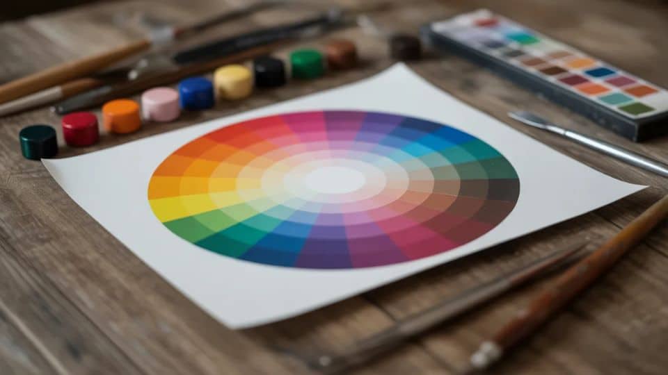
The Color Wheel: Your Essential Creative Map

The color wheel organizes hues in a circular format, revealing mathematical relationships that help artists create balanced, visually appealing compositions.
This tool serves as your reference guide for mixing pigments, identifying complementary pairs, and building cohesive color schemes.
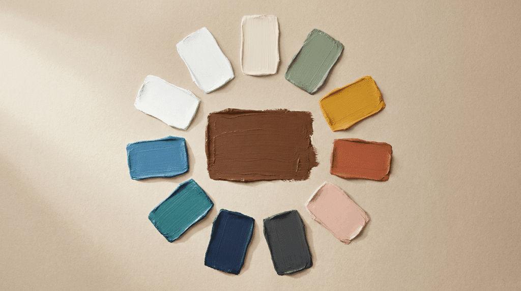
The wheel contains three categories of colors: primary, secondary, and tertiary hues arranged in a specific order.
1. Primary Colors: The Genetic Foundation
Primary colors are unique because they possess no parent colors; they are pure. In any professional studio, these are the only tubes of paint that cannot be manufactured by mixing other pigments.
Red: In art, red serves as the ultimate “advancing” color. It has a long wavelength that physically grabs the viewer’s attention. Use it to establish focal points or add warmth to skin tones.
Yellow: This is the most luminous hue on the wheel. It often represents the primary light source in a composition. Because it has a high value (lightness), it is easily overpowered by other pigments.
Blue: Blue acts as the structural anchor. It is a “receding” color, meaning it appears to move away from the viewer. This makes it essential for creating atmospheric perspective and deep, believable shadows.
2. Secondary Colors: The First Transformation
Secondary colors occur when you mix two primaries in equal parts. This stage is where your palette begins to develop a specific “mood” or temperature.
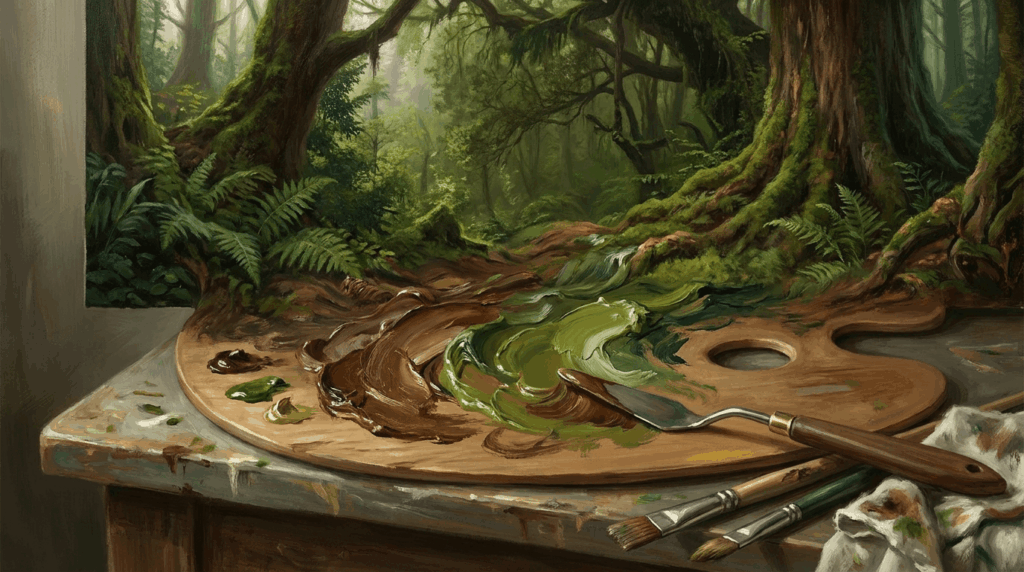
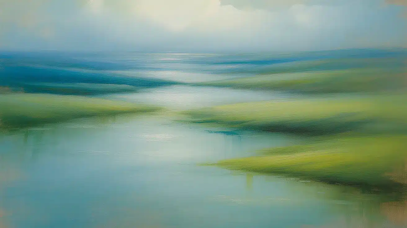
Green (Blue + Yellow): The most abundant color in nature. It balances the energy of yellow with the stability of blue, making it ideal for landscapes.
Orange (Red + Yellow): This is the warmest secondary color. It radiates energy and is often used by American impressionists to capture the “golden hour” of sunlight.
Purple/Violet (Red + Blue): Purple is the most complex secondary color because it combines the highest energy (red) with the deepest stability (blue). It is frequently used to add mystery or royal weight to a piece.
3. Tertiary Colors: The Nuance of Realism
Tertiary colors (also called intermediate colors) are created by mixing a primary color with its neighboring secondary color. This is where professional-level realism happens, as these hues mimic the subtle transitions found in the real world.
Red-Orange & Yellow-Orange: These “sunset” tones allow for smooth transitions in fire, skin, or autumn leaves.
Yellow-Green & Blue-Green (Teal): These are vital for botanical accuracy. Blue-green is particularly useful for painting deep water or foliage shadows.
Blue-Violet & Red-Violet: These bridge the gap between cool shadows and warm highlights, often used in floral painting and complex portraiture.
Mixing two primary hues yields secondary colors such as green, orange, and purple, significantly expanding your creative palette.
| Color Type | Components | Artistic Purpose |
| Primary | Pure Pigments | Building blocks of all colors. |
| Secondary | Primary + Primary | Creating balanced visual harmony. |
| Tertiary | Primary + Secondary | Adding realistic nuance to art. |
Tertiary colors bridge the gap between primary and secondary colors, creating sophisticated transitions such as blue-green or red-orange.
Color Properties Every Artist Should Know
Color theory defines every hue using three distinct properties: hue, value, and saturation that control visual impact.
Understanding these characteristics allows you to manipulate viewer attention, create believable three-dimensional forms, and establish clear focal points.
1. Hue: The Pure Name of Color
Hue refers to the pure color name on the wheel, identifying whether you’re working with red, blue, green, or any specific color family.
Artists select hues based on mood, subject matter, and desired psychological impact, using warm and cool temperature associations to guide emotional responses.
2. Value: Lightness and Darkness Control
Value measures the lightness or darkness of a color, proving critical for establishing form, realistic lighting, and three-dimensional depth in compositions.
Artists add white to create tints or complementary colors for shades, using value contrast strategically to control where viewers look first.
3. Saturation: Intensity and Vividness
Saturation describes the intensity or vividness of color, distinguishing bright focal points from muted background elements and creating depth and visual hierarchy in artwork.
Professional artists use high saturation sparingly at focal points only, keeping background elements desaturated to avoid competing with main subjects for attention.
These three properties work together as building blocks for every color theory application in your artwork.
Practical Color Harmony Techniques with Examples
Color theory provides proven harmony formulas based on mathematical relationships that naturally create pleasing visual combinations.
Selecting a specific harmony scheme establishes a psychological atmosphere and guides the viewer’s experience through your composition.
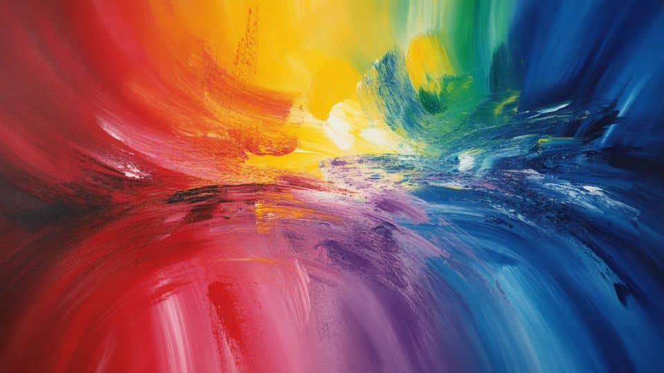
1. Complementary Colors: High Contrast Drama

Complementary color schemes use opposite wheel positions to create maximum contrast and visual vibration.
Red and green, blue and orange, and yellow and purple form the three main complementary pairs.
Placing complementary colors adjacent to each other makes both hues appear more intense and energetic. Artists use this technique to make focal points “pop” with dramatic emphasis.
However, overusing complementary contrast throughout an entire composition creates visual chaos and viewer fatigue.
2. Analogous Colors: Soothing Natural Combinations
Analogous harmonies use three to five neighboring colors on the wheel for serene, cohesive appearances.
Examples include blue, blue-green, green, and yellow-green combinations common in landscape paintings and natural scenes.
This approach mimics how colors appear together in nature, creating a sense of automatic visual harmony.
Analogous schemes work exceptionally well for backgrounds and secondary elements requiring unity without competition.
Choose one color to dominate, with others providing supporting accents for the best results.
3. Triadic and Tetradic Schemes: Balanced Vibrancy

Triadic palettes use three evenly spaced wheel colors, while tetradic schemes use four colors in two complementary pairs.
Red, yellow, and blue form a primary triadic scheme offering maximum variety with balance.
These complex harmonies create vibrant, energetic compositions suitable for illustrations and complex subject matter.
Apply the 60-30-10 rule: designate one dominant color (60%), one supporting hue (30%), and one accent (10%).
This proportion maintains visual hierarchy while preventing overwhelming color competition.
Strategic harmony selection based on color theory principles ensures your palette supports rather than fights your artistic message.
Color Psychology: Convey Emotion and Meaning
Color theory extends beyond technical mixing to encompass psychological associations that influence viewer emotions and interpretations.
Following these connections allows you to make intentional choices that reinforce your artistic narrative and desired mood.
1. Common Color Associations in Art
Each color carries psychological weight, influencing how viewers interpret and emotionally respond to your artistic work.
| Color | Psychological Association | Best Used For |
|---|---|---|
| Red | Passion, urgency, excitement | Focal points, dramatic emphasis |
| Blue | Calmness, trust, peace | Peaceful scenes, backgrounds |
| Green | Nature, growth, harmony | Landscapes, natural subjects |
| Yellow | Joy, optimism, brightness | Highlights, light sources |
| Orange | Enthusiasm, warmth, energy | Energetic subjects, sunsets |
| Purple | Luxury, mystery, spirituality | Elegant compositions, shadows |
These universal associations provide a foundation for creating emotionally intelligent color choices in every piece you create.
2. Applying Psychological Principles
Contemporary art trends favor earthy greens and browns, reflecting current cultural desires for stability and a sense of natural connection.
Warm palettes (reds, oranges, yellows) create intimate or energetic moods, while cool palettes (blues, greens) establish calm or distant atmospheres effectively.
Artists combine temperature control with saturation adjustments to fine-tune specific emotional responses they want viewers to experience when engaging with artwork.
Test your color choices on small sketches first to preview the psychological impact before committing to final compositions.
The intentional application of color theory and psychology strengthens your ability to communicate specific messages purely through visual means.
Step-by-Step: Applying Color Theory to Your Art

Color theory principles become powerful tools when translated into a practical workflow for actual painting and design projects.
This systematic approach helps you make confident decisions from initial concept through final refinement.
Step 1: Choose Your Dominant Mood and Theme
Begin by identifying the primary emotion or atmosphere you want viewers to experience when seeing your work.
This decision guides every subsequent color theory choice throughout your creative process. Consider whether your subject demands warmth or coolness, high energy or quiet contemplation.
Write down three adjectives describing your intended mood before touching any paint or pixels.
Step 2: Refer to the Wheel for Base Palette
Use the color wheel to select an appropriate harmony scheme matching your mood objectives from step one.
Complementary schemes suit dramatic, high-energy subjects requiring strong contrast and immediate visual impact.
Analogous schemes work better for harmonious, peaceful subjects needing unity and natural flow. Triadic schemes offer balanced variety for complex compositions with multiple focal points or narrative elements.
Step 3: Balance Hue with Value and Saturation
Apply color theory by adjusting value contrast and saturation levels according to your composition’s focal hierarchy.
Reserve the highest saturation and strongest value contrast for your primary focal point only. Reduce saturation and minimize value contrast in background elements to create spatial depth.
Consider how warm hues advance and cool hues recede when planning foreground versus background treatment.
Step 4: Test on Small Studies First
Create quick color studies or thumbnail sketches before committing to full-scale execution of your vision.
This testing phase reveals potential problems with your color theory application before investing significant time.
Adjust harmony choices, temperature balance, or saturation distribution based on study results. Many professionals complete five to ten small studies before selecting their final palette.
Step 5: Refine Contrast and Harmony
Make final adjustments to your color relationships as you complete your artwork, maintaining consistent color theory principles.
Step back frequently to evaluate overall harmony and ensure your focal point maintains proper emphasis.
Adjust individual color temperatures, values, or saturations while preserving your original harmony structure.
Trust your color theory knowledge while remaining open to intuitive refinements during execution.
Following this systematic workflow grounds your color decisions in proven color theory principles rather than guesswork.
Common Mistakes Artists Make and Solutions
Even experienced artists sometimes overlook fundamental color theory principles, creating avoidable problems that diminish their finished works.
| Common Mistake | Problem Created | Solution |
|---|---|---|
| Too Many Colors | Overwhelms viewers and lacks focus. | Limit to three to five colors per piece. |
| Ignoring Value | Creates flat compositions without depth. | Convert work to grayscale to check contrast. |
| Using Pure Black | Deadens colors and removes luminosity. | Mix blues or purples for shadows instead. |
Avoiding these common mistakes ensures your color theory knowledge translates into visually successful finished artwork that captivates viewers.
Conclusion: Make Color Your Creative Advantage
Color theory provides a proven framework for making intentional decisions that amplify your artistic vision and strengthen emotional communication with viewers.
Throughout this guide, you’ve learned how primary colors build secondaries and tertiaries, how value and saturation control visual hierarchy effectively.
You’ve learned how harmony schemes create psychological atmosphere in compositions, and how temperature influences mood and spatial perception in artwork.
These principles offer structure without limiting creativity, giving you confidence to experiment while maintaining cohesive, professional results in every piece.
Apply one new color theory concept, such as complementary contrast or analogous harmony, to your next project. Practice consistently to enhance visual impact and evoke emotions.
Ready to take your art to the next level? Grab your paints or digital tools and put color theory into action today.